Custom Typeface & Cafe/Performance Venue Branding: Baja California
This project explores the intersection of typography, music, and spatial branding through the creation of a custom typeface and its application to a café and performance venue. A randomly assigned typeface and music genre serve as the foundation for developing a cohesive visual identity.
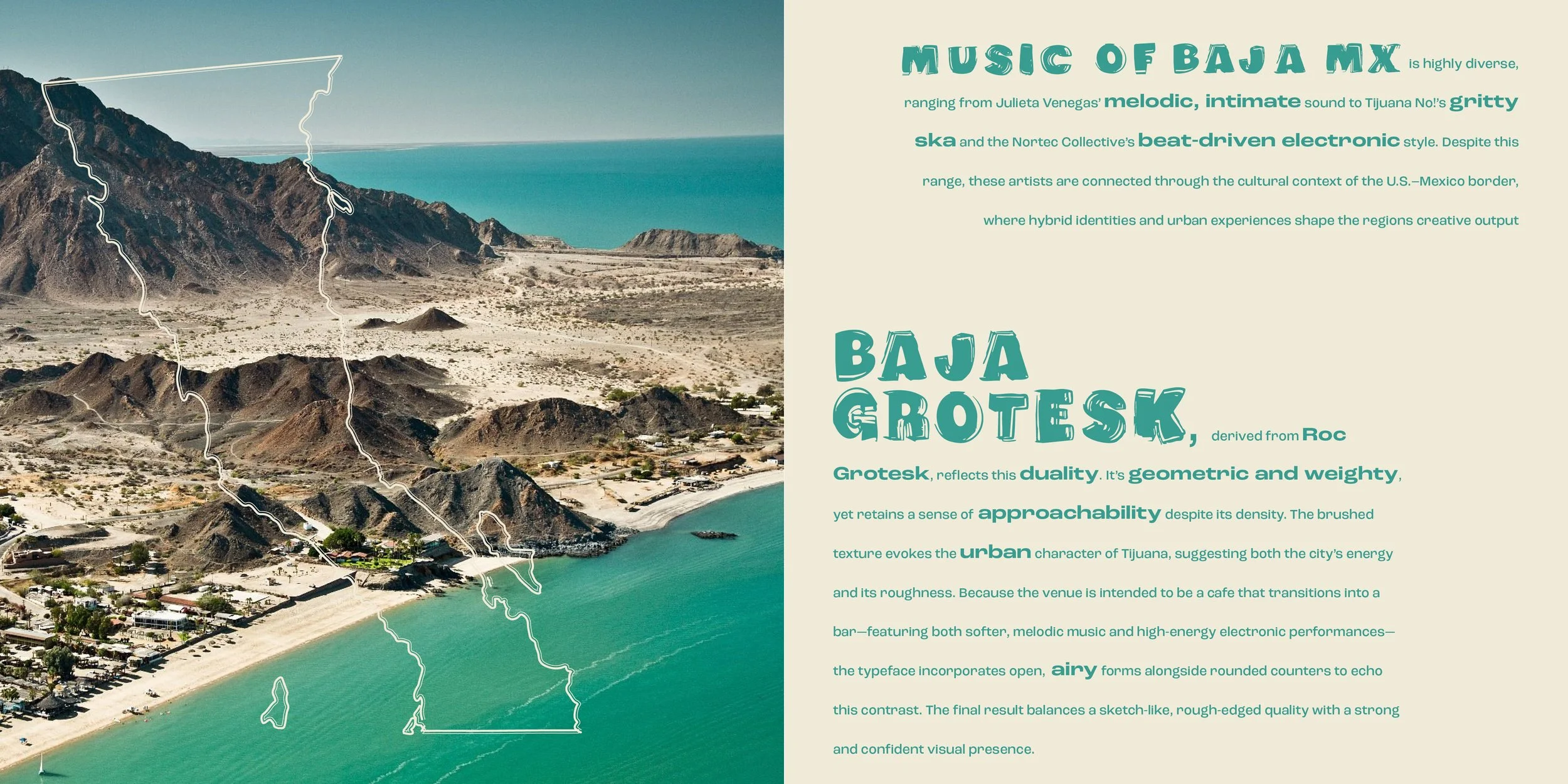
For this project, I was assigned the music of Mexico and chose to focus specifically on the Baja California region. This regional lens informed both the conceptual direction and visual language of the work, connecting local musical culture with place-based design.
I developed the concept of a hybrid café that transitions into a bar, reflecting the diversity of the music being played—from more relaxed, daytime sounds to energetic nighttime performances. This shift in atmosphere became a central idea in both the spatial experience and the visual identity system.
Mood Board & Mind Map
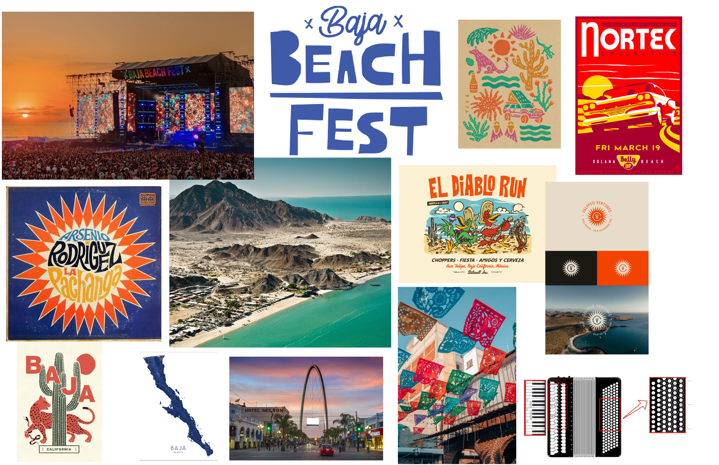
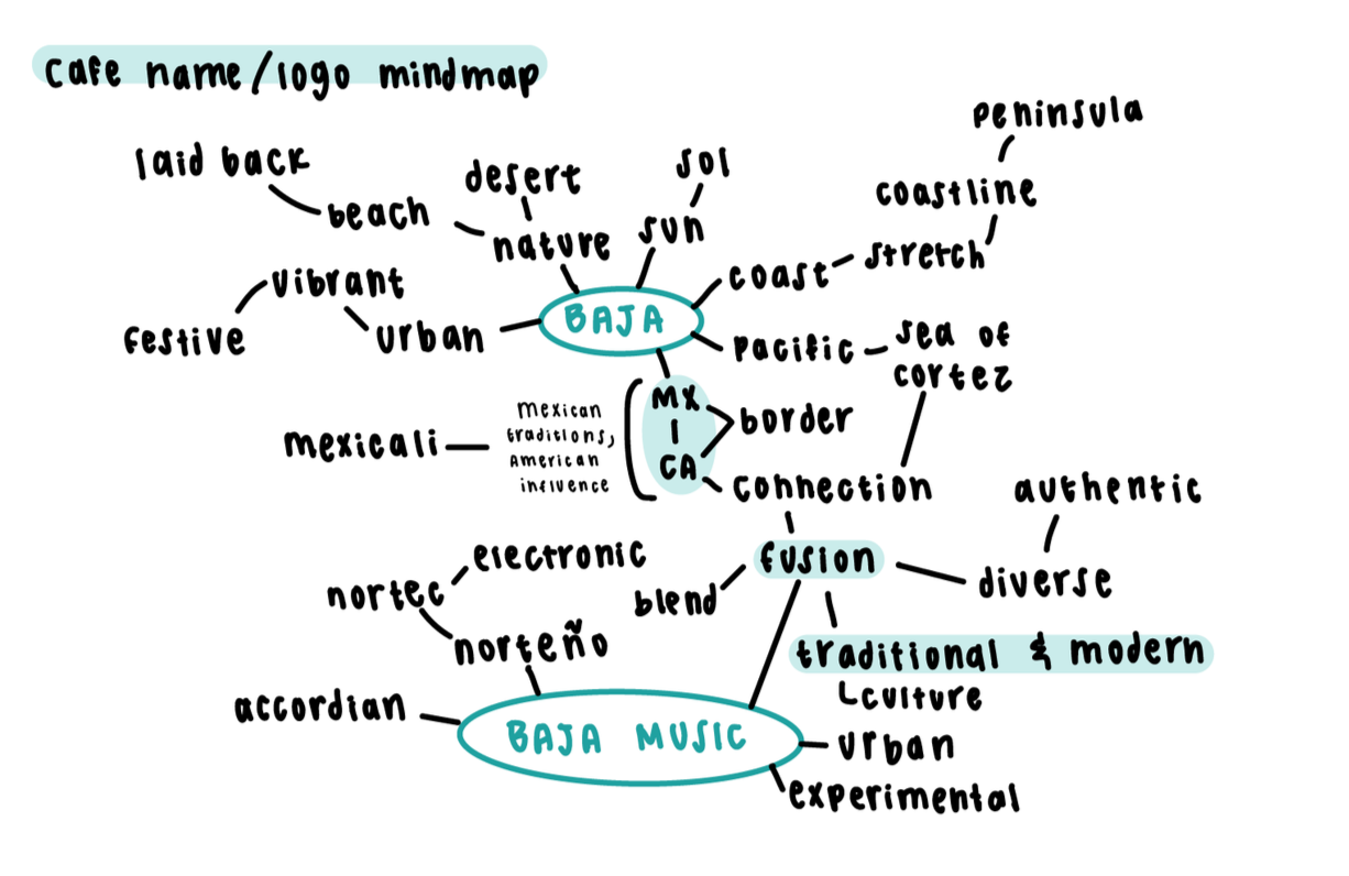
The project began with in-depth research into Mexican music, with a focus on Baja California’s regional influences, cross-border culture, and contemporary music scene. I examined the evolution of the genre and identified key characteristics such as rhythm, instrumentation, and cultural context.
Visual research explored design elements, imagery, and motifs associated with Mexican and Baja California music scenes, alongside case studies of venues/cafes. These insights informed the concept of a space that evolves throughout the day.
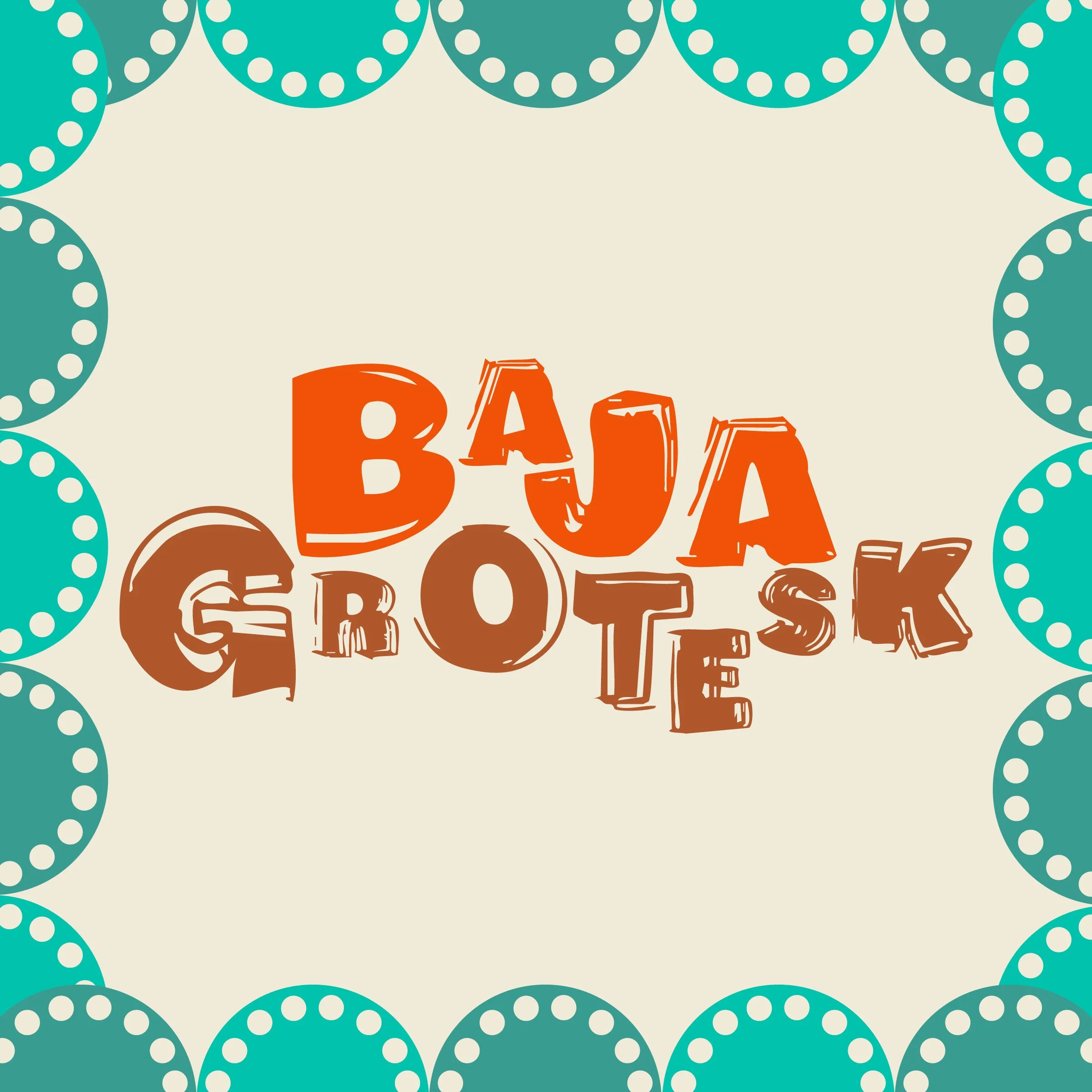
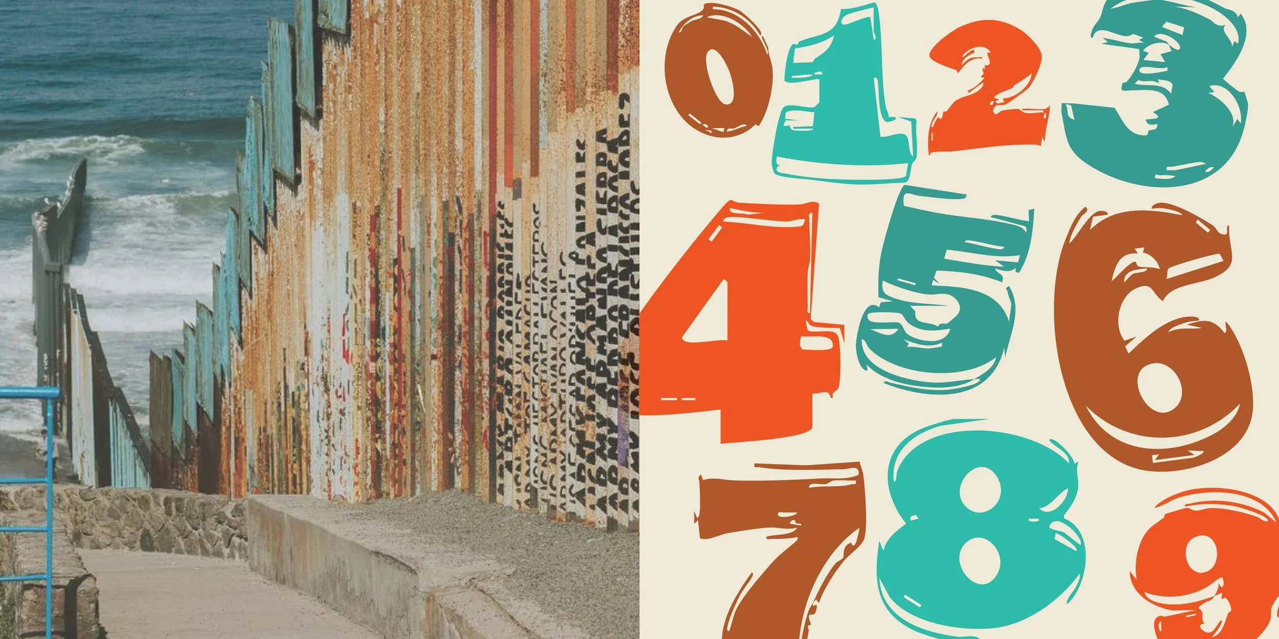
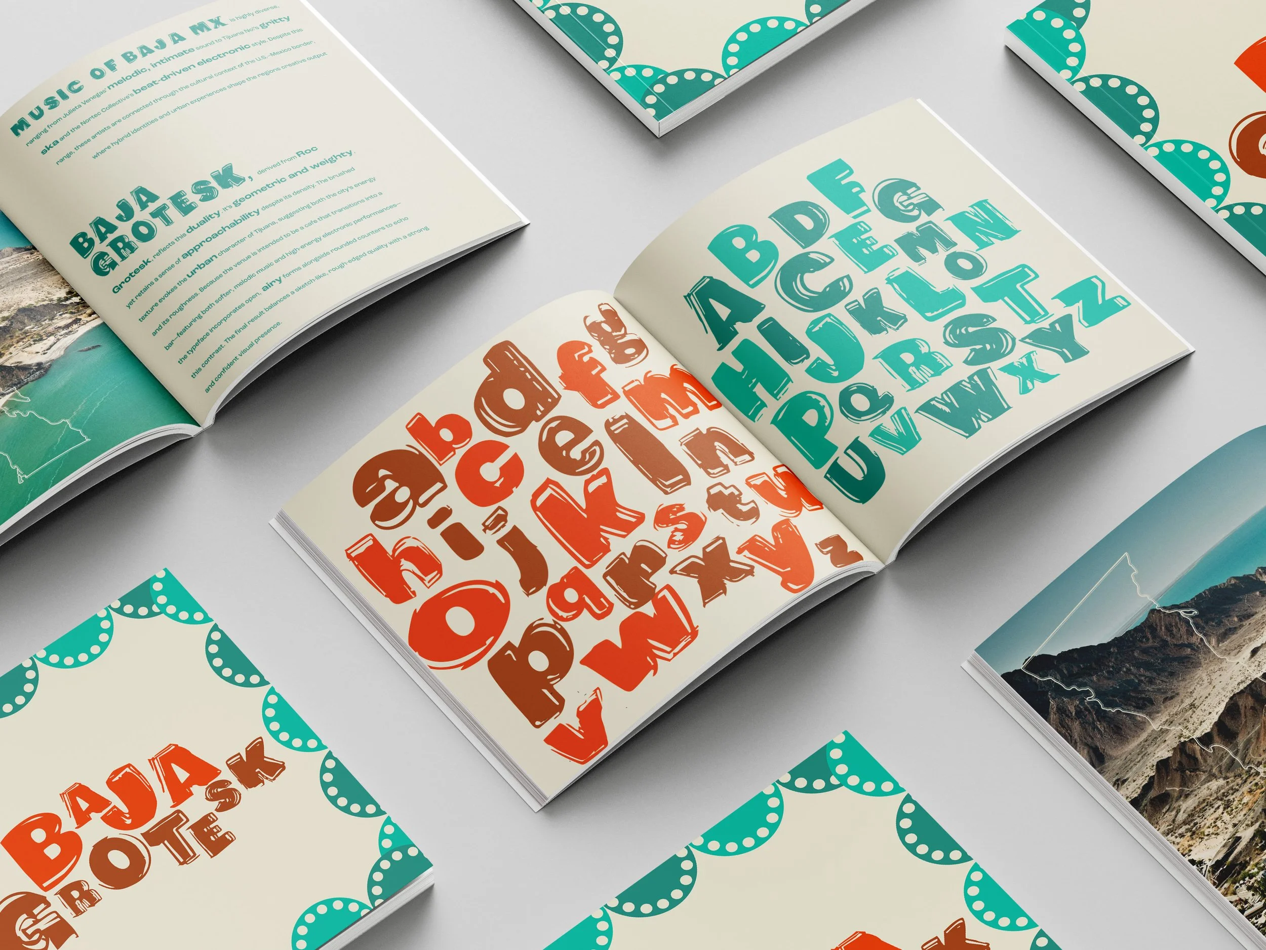
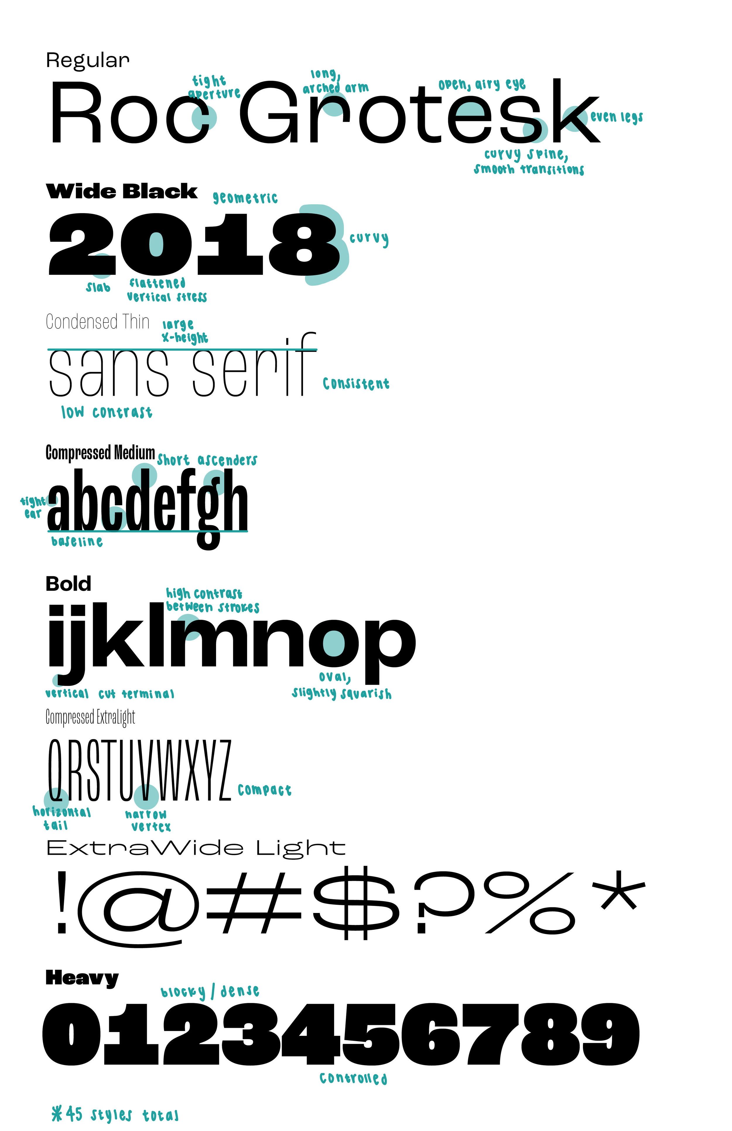
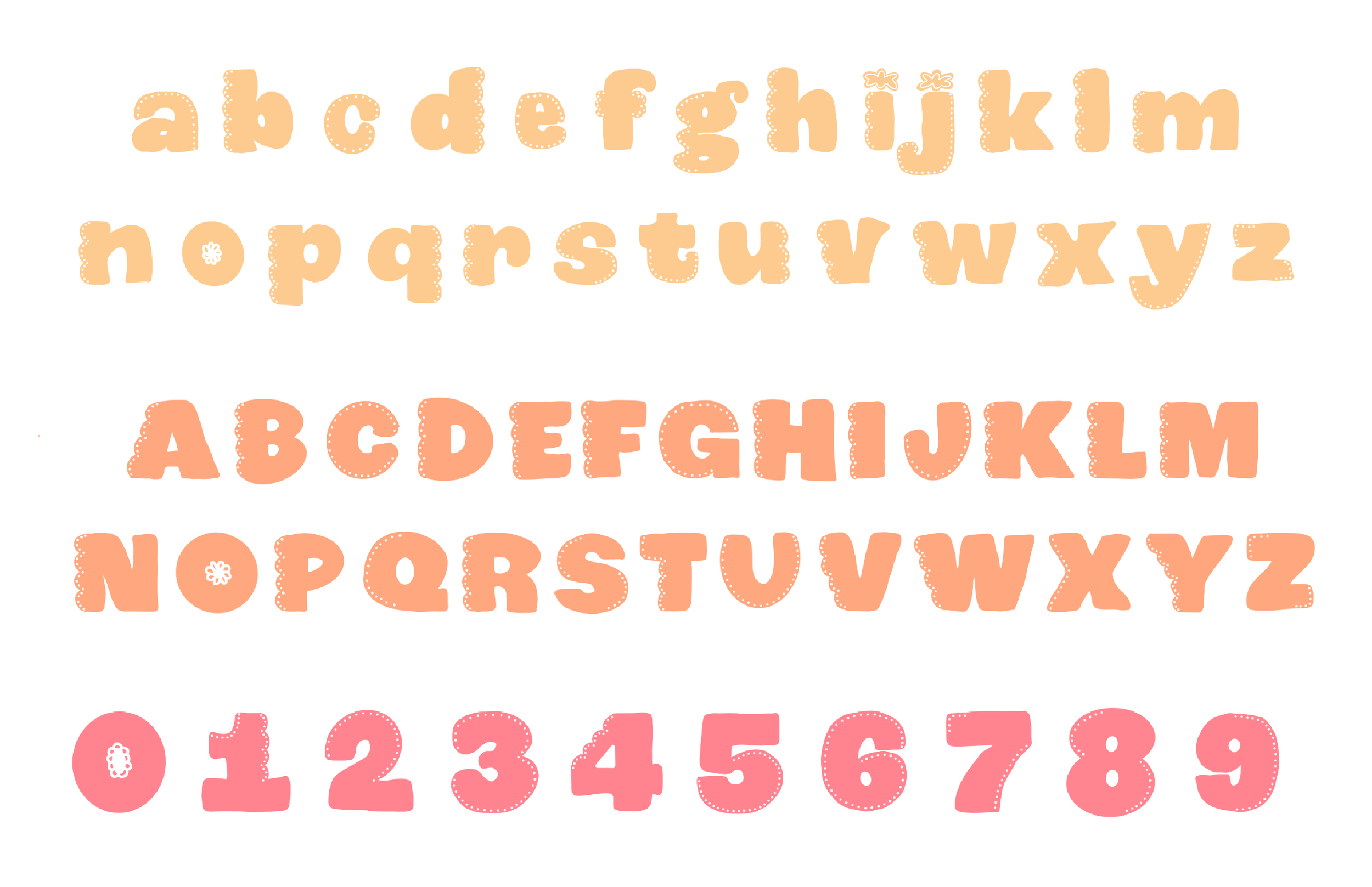
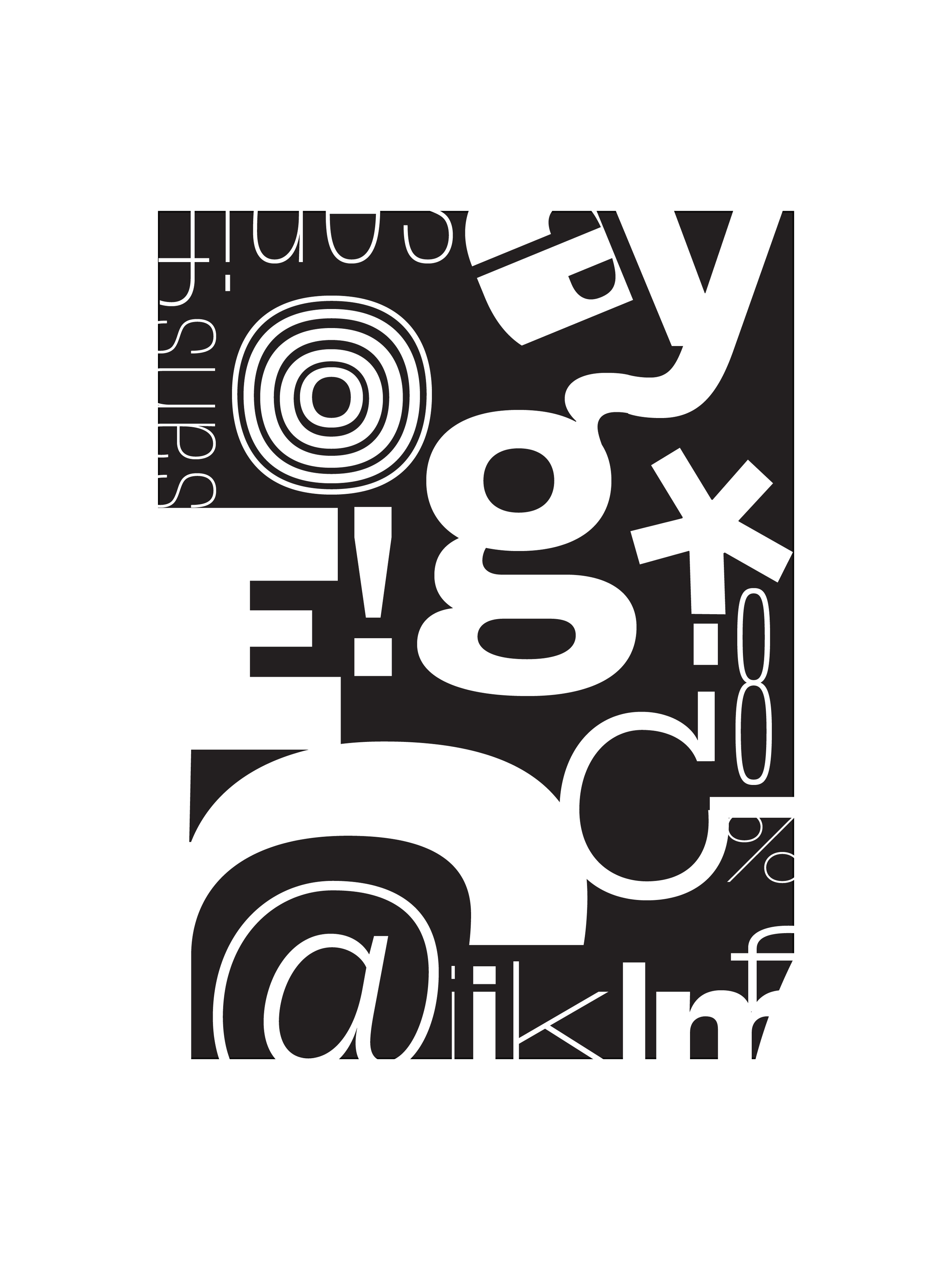
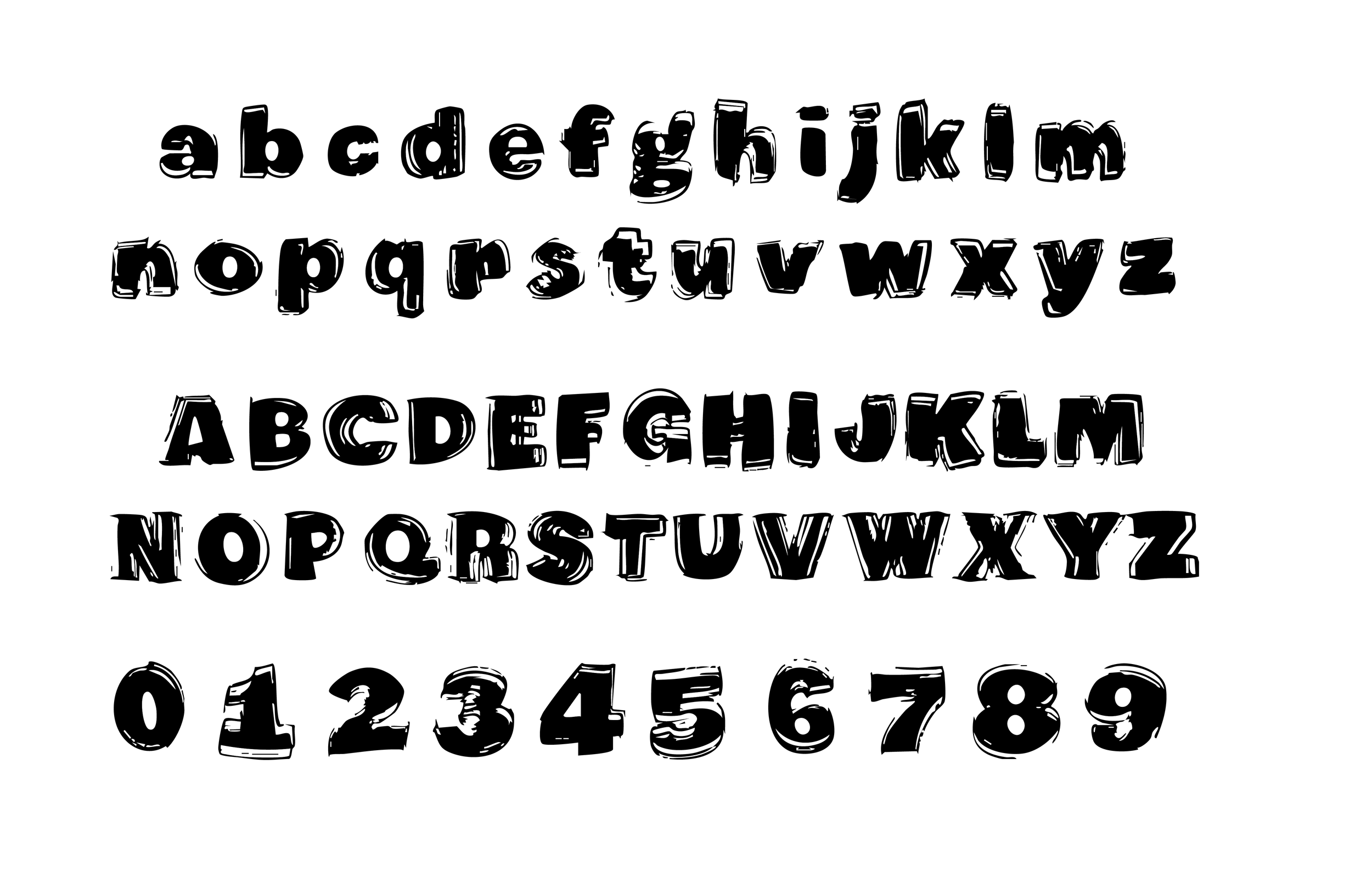
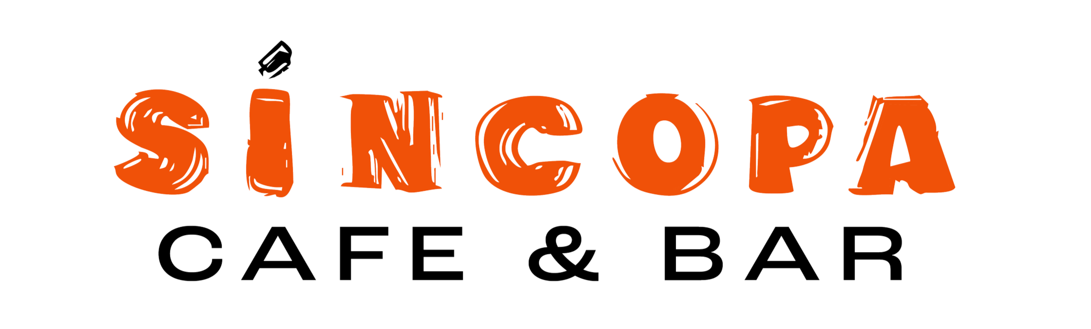
Typeface Design: Baja Grotesk
A custom typeface developed through the modification of Roc Grotesk, inspired by the energy and cultural texture of Baja California’s music scene. The design process began with hand-drawn explorations, initially referencing traditional fiesta flags before evolving toward a more urban and contemporary direction.
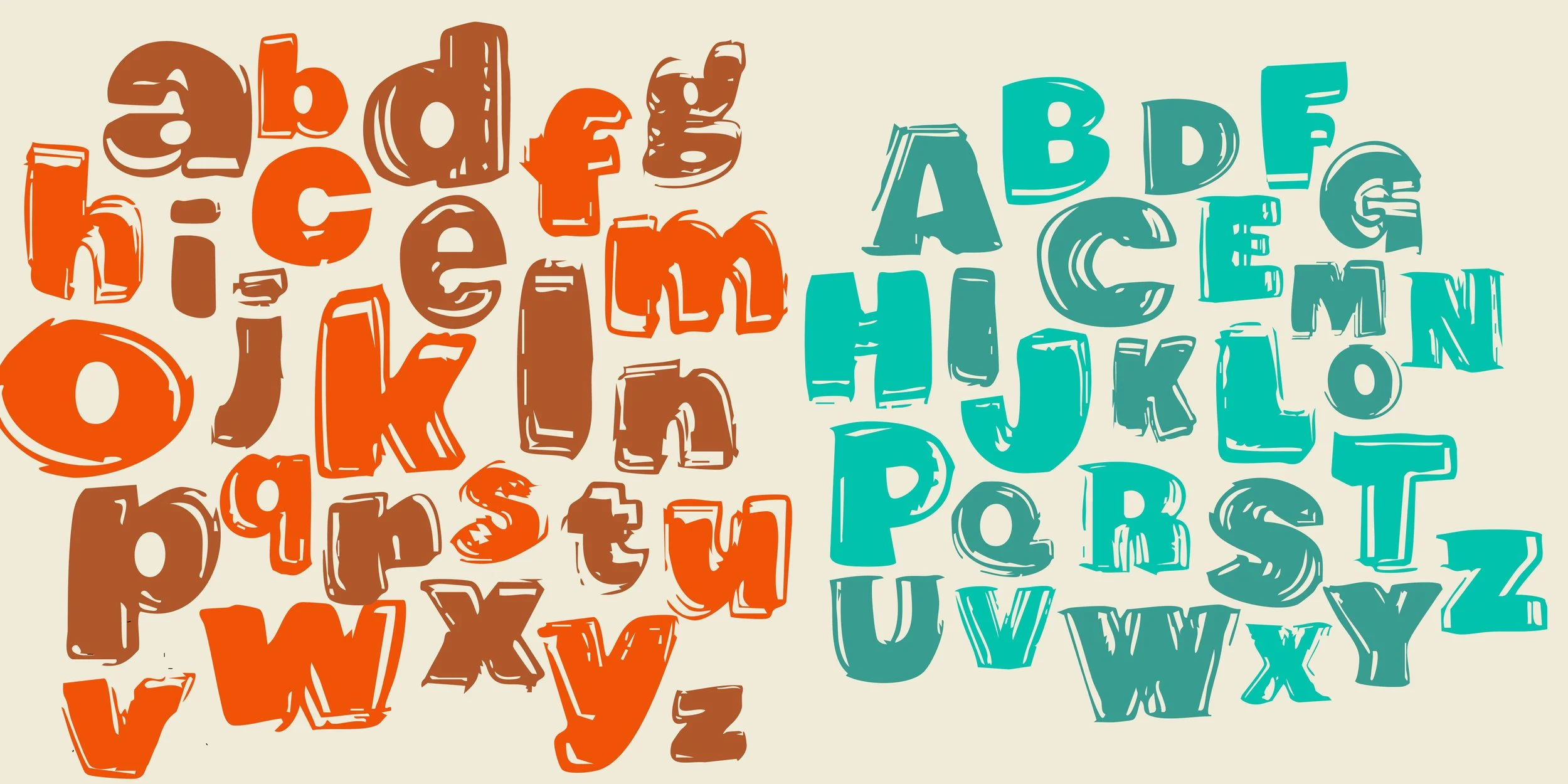
The final typeface retains the structural integrity of the original font while introducing expressive, rough-edged details that reflect both the relaxed café atmosphere and the vibrant energy of local bars and performance spaces. The result is a typeface that feels dynamic, approachable, and distinctly rooted in its cultural context.
Initial Font Redesign
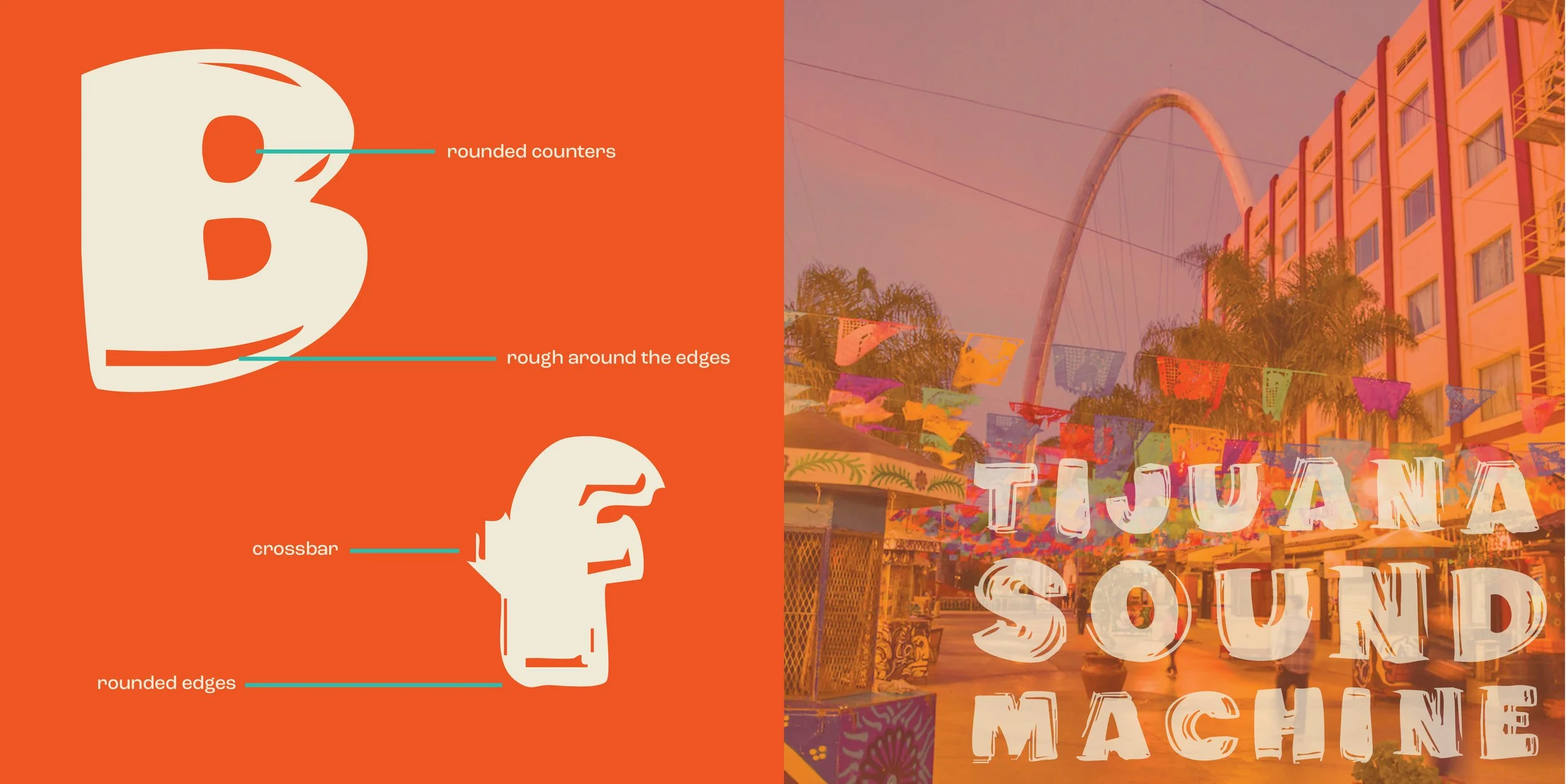
Roc Grotesk Type Anatomy Explorations
Final Font Redesign
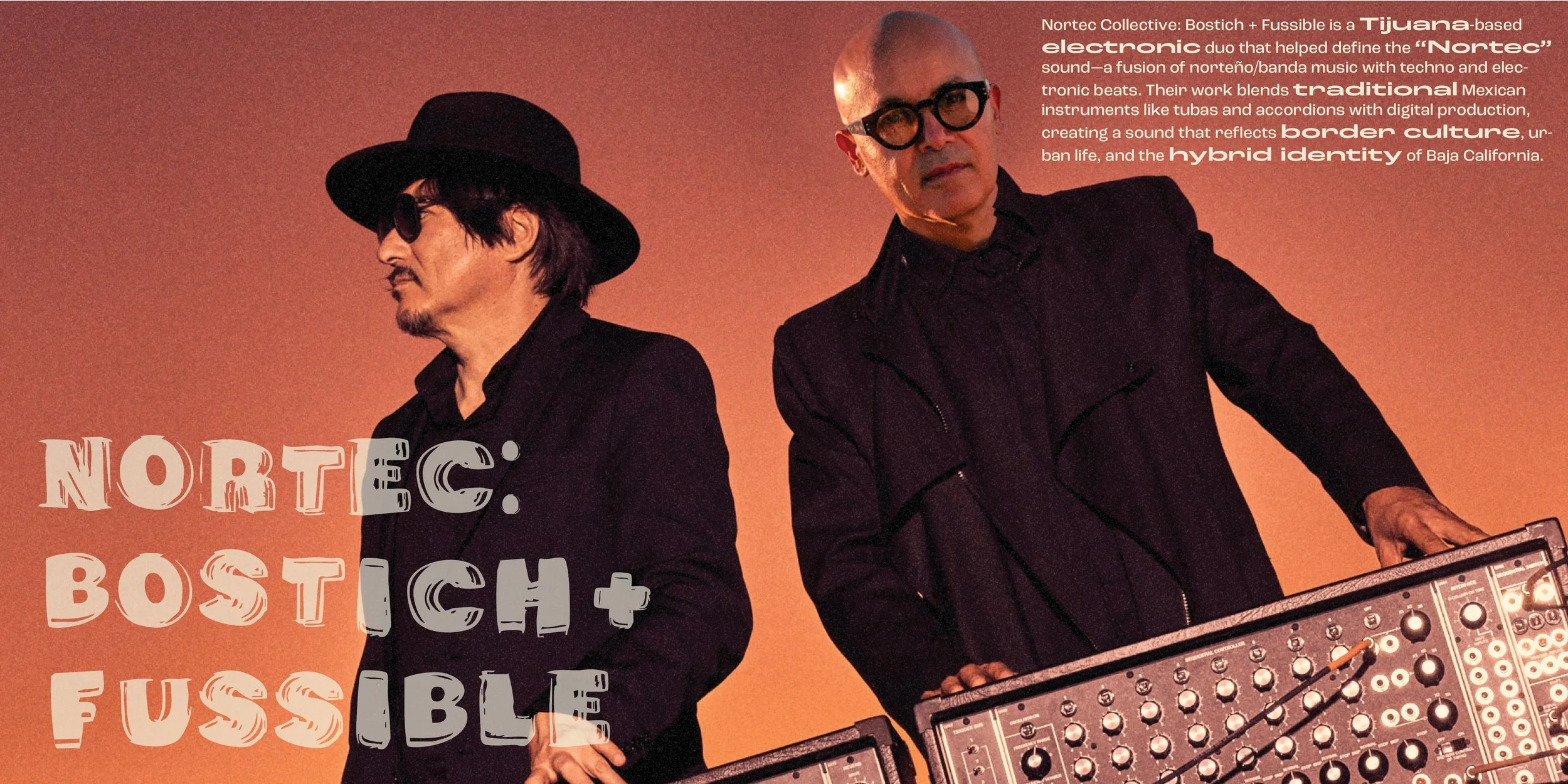
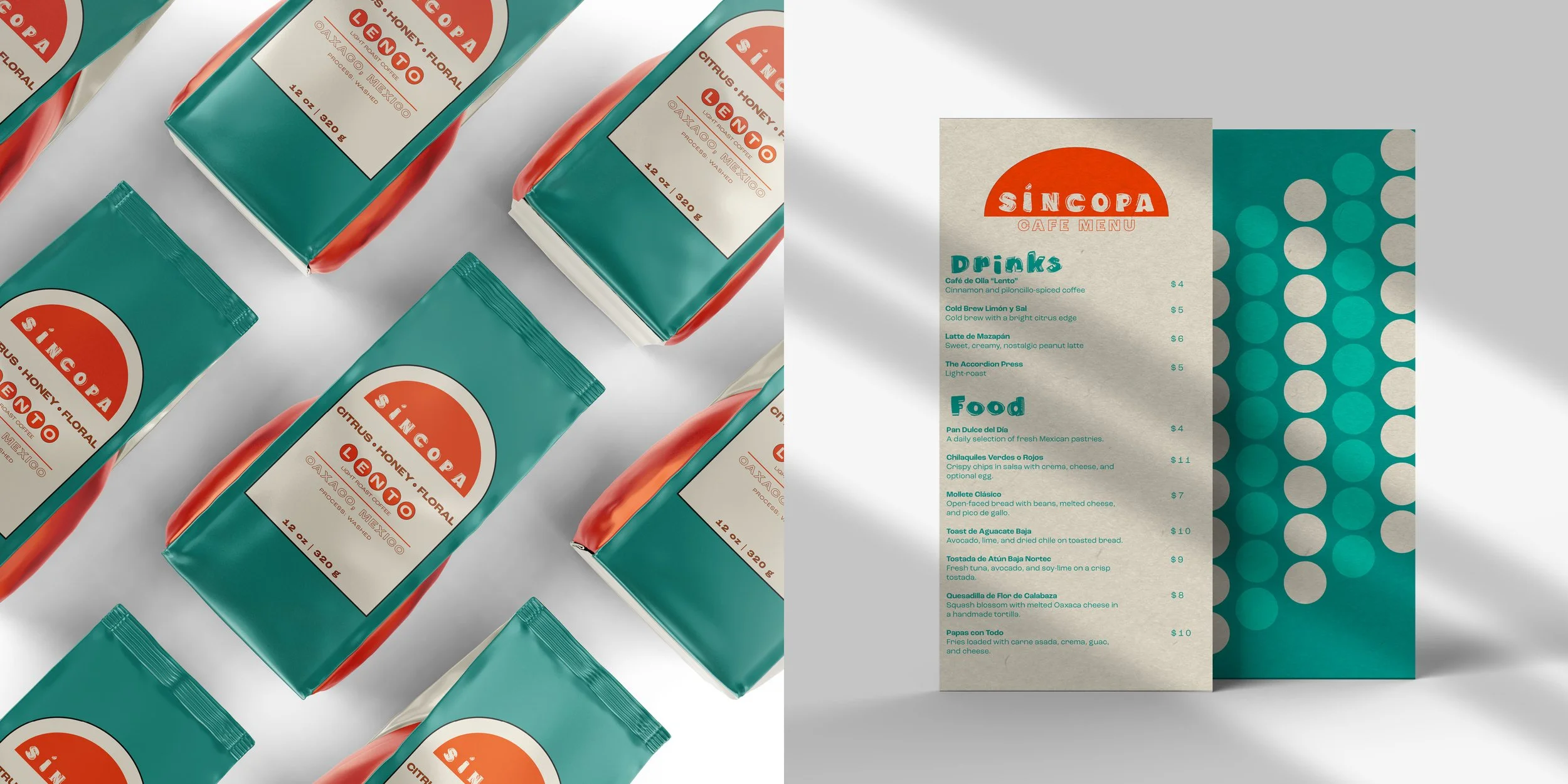
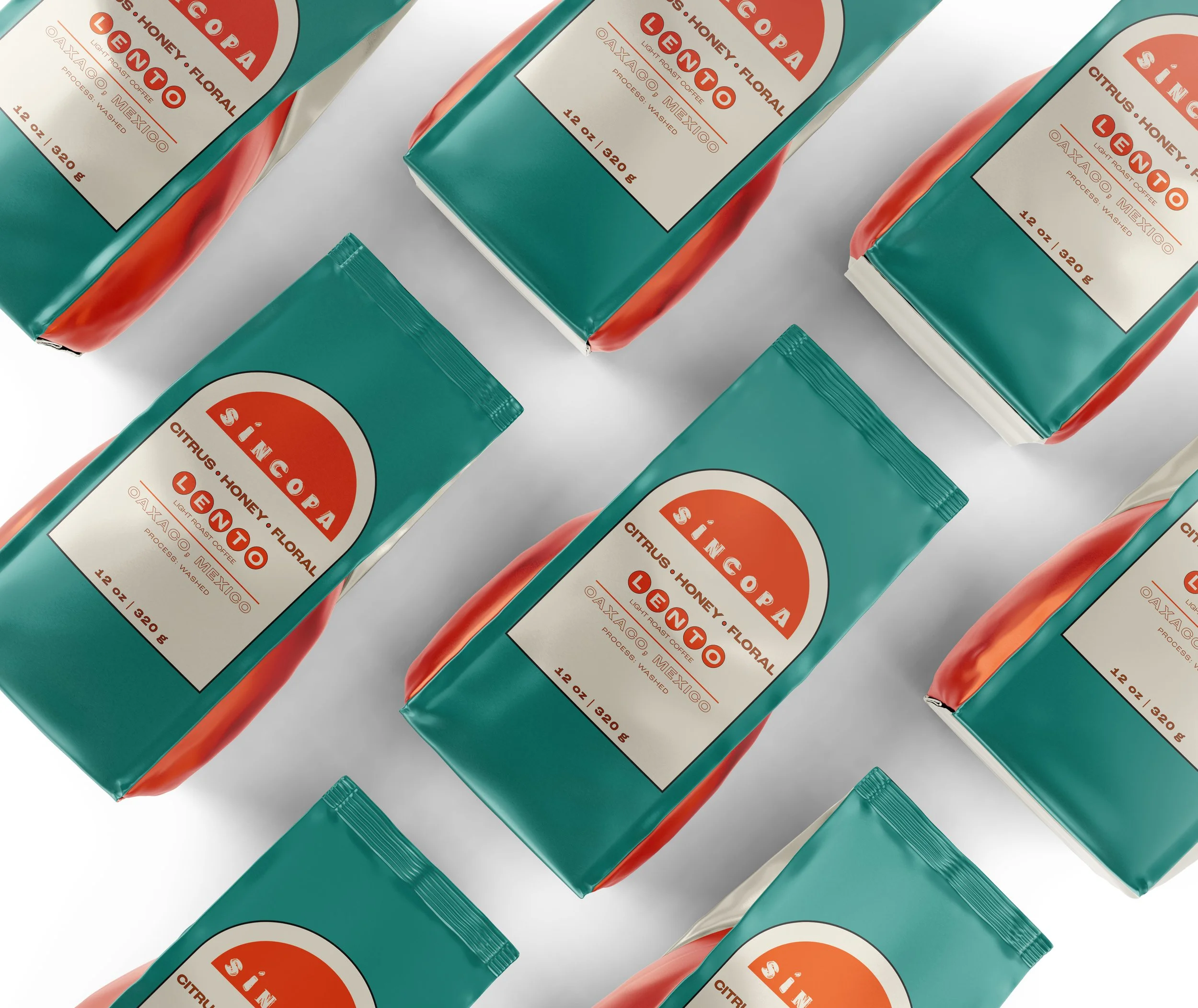
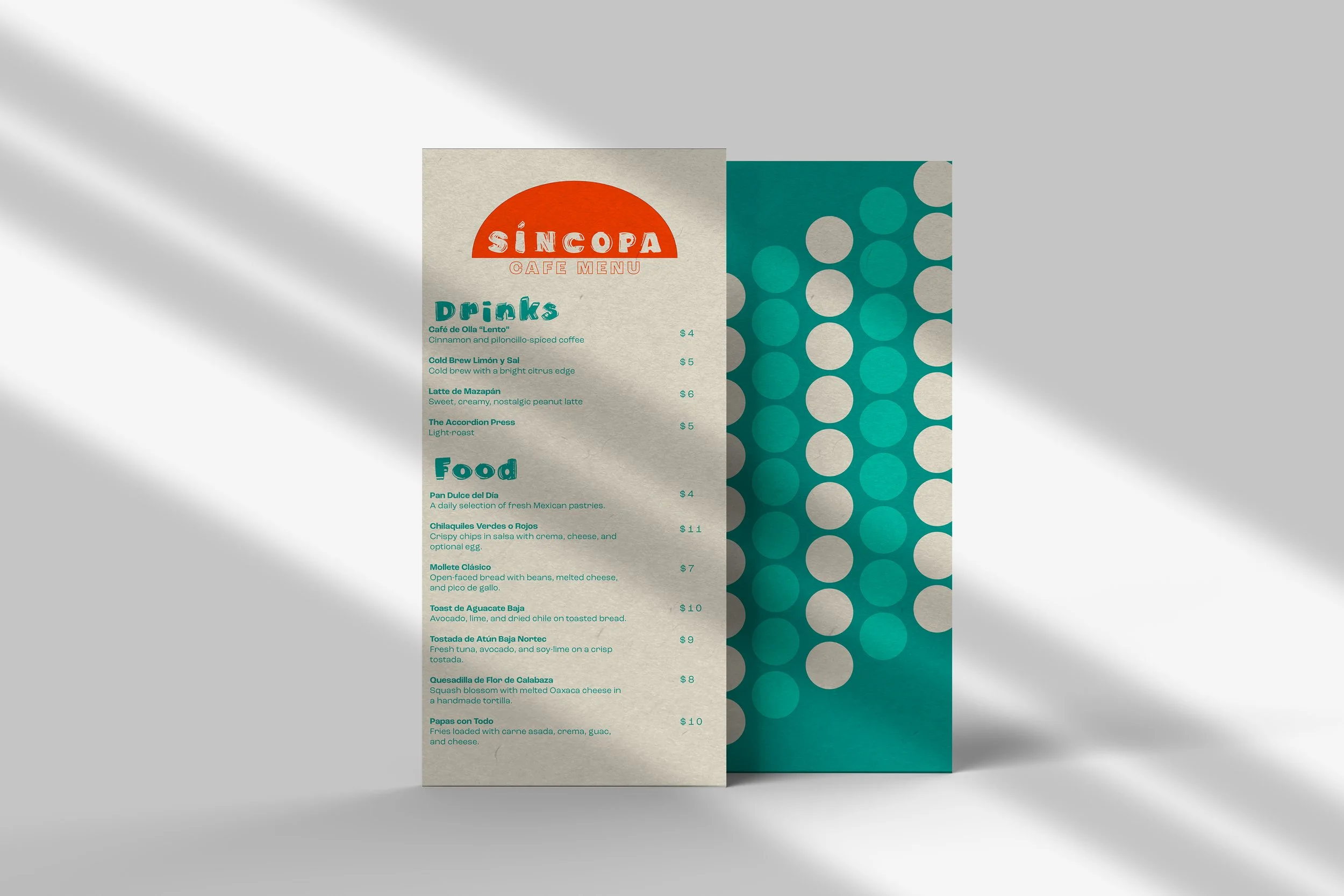
Branding & Application
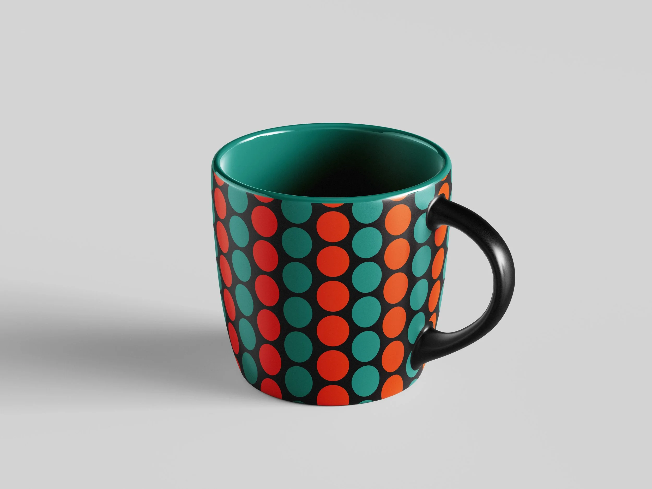
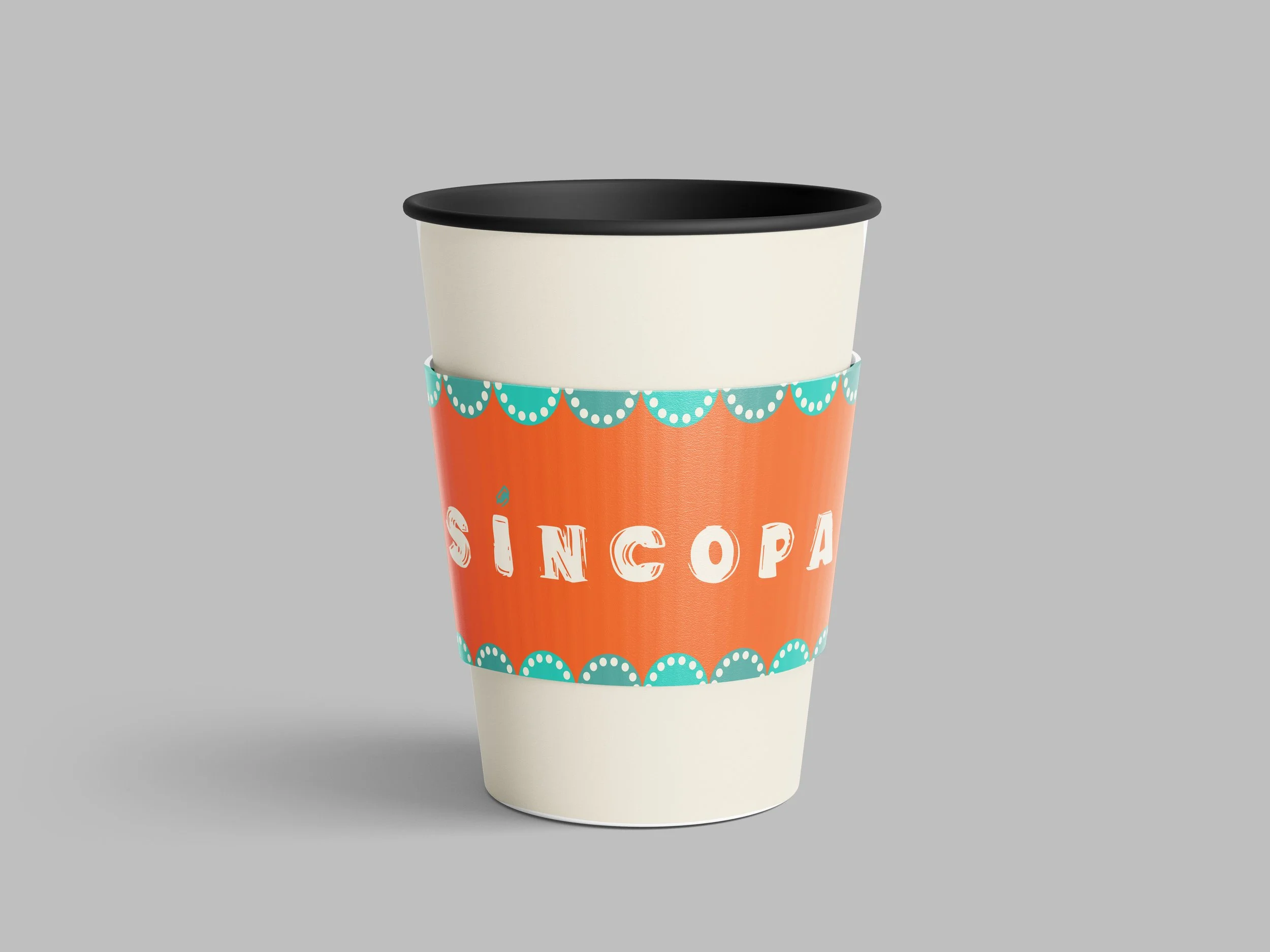
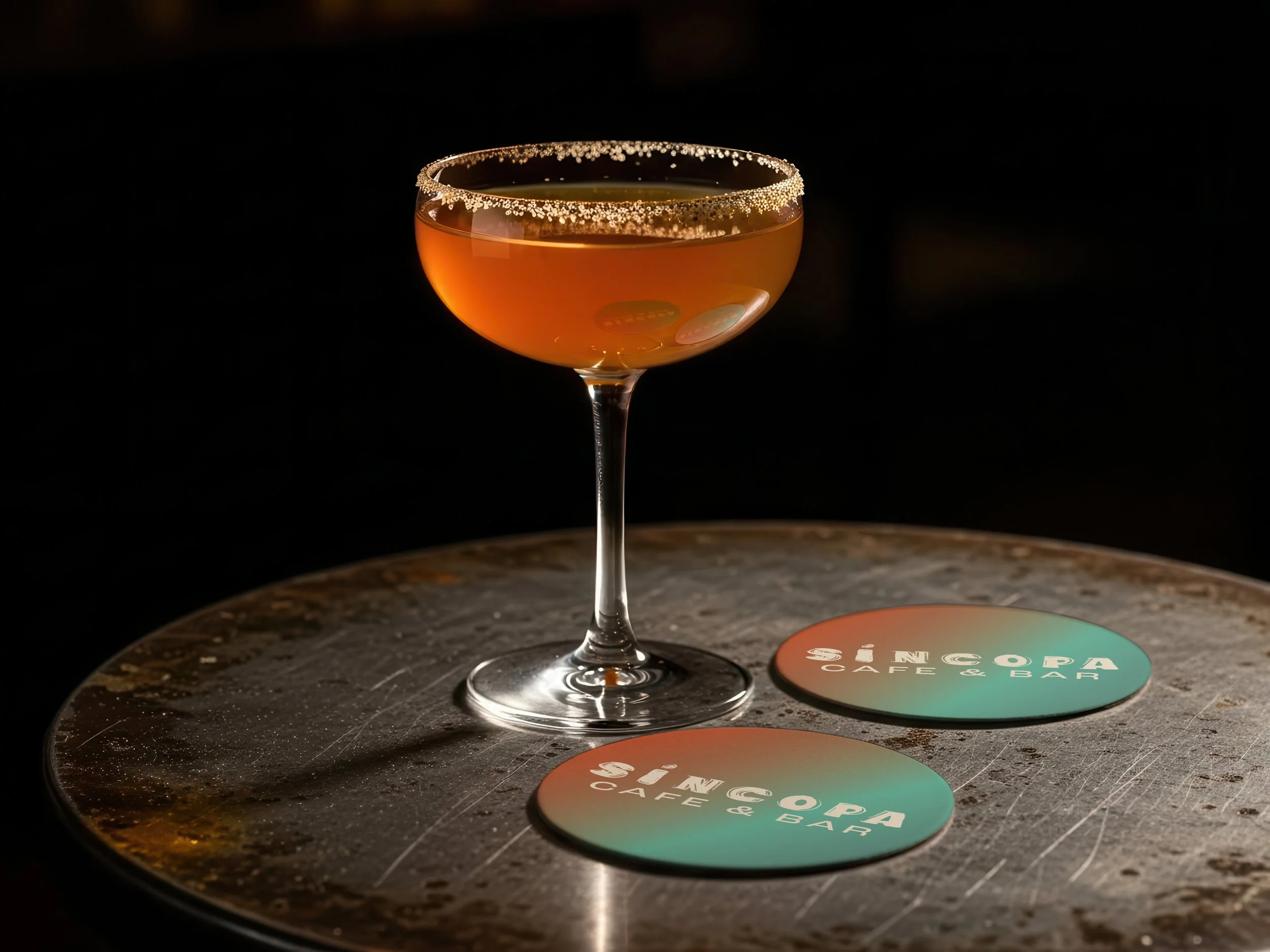
The custom typeface was applied to create a cohesive identity for Síncopa—a café/bar performance venue. The branding reflects a dual atmosphere—calm and inviting during the day, and dynamic and energetic at night.
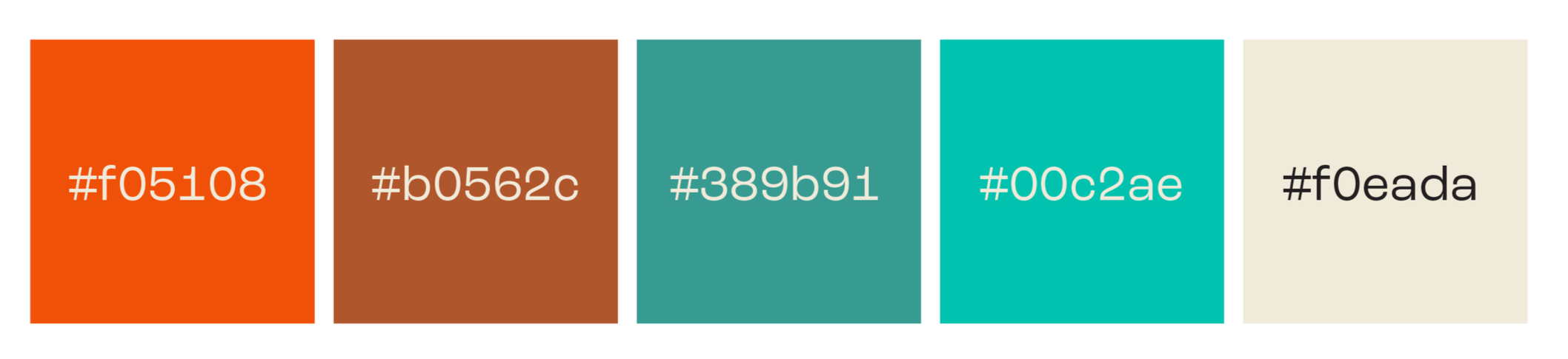
Typography & Color
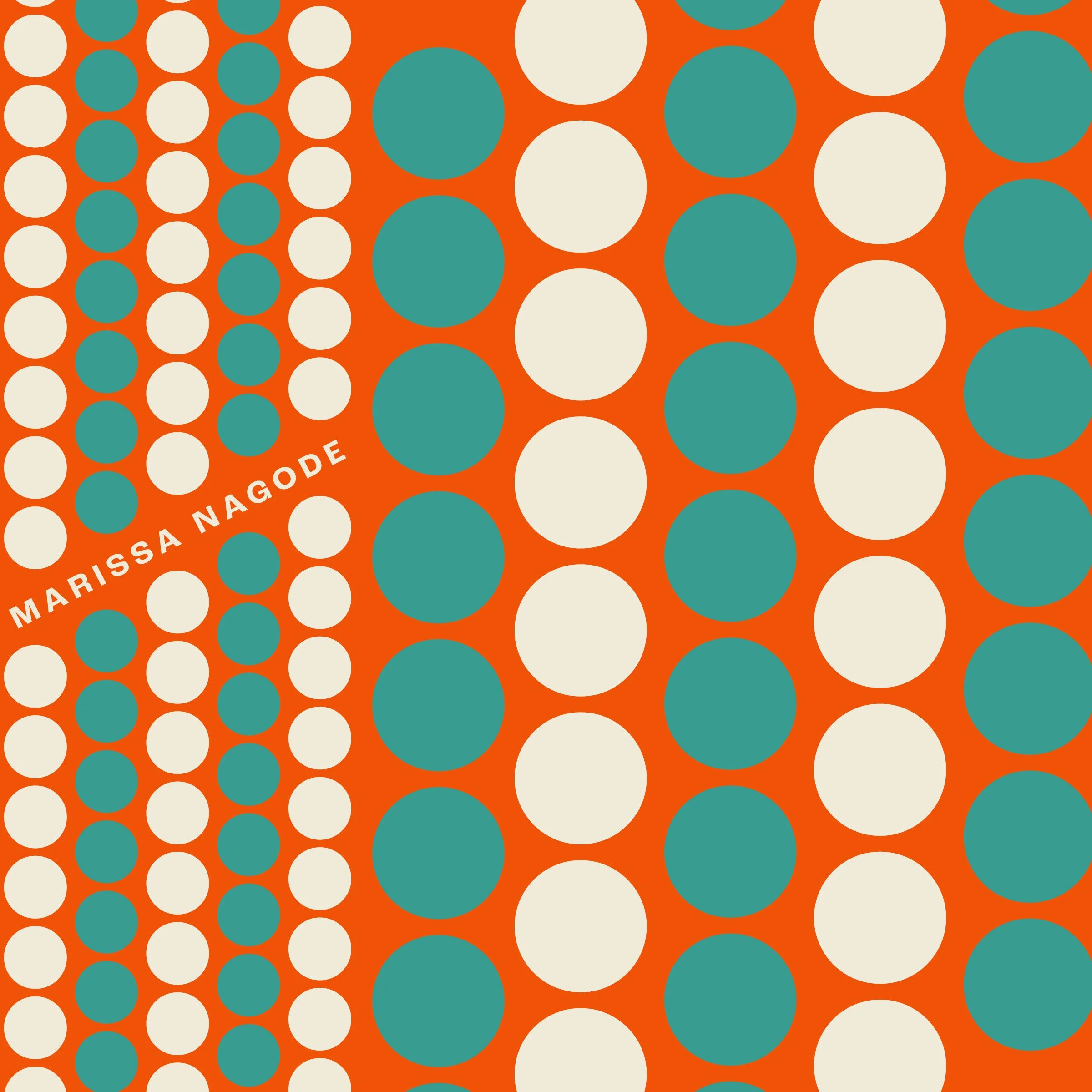
My primary typeface is the custom-designed Baja Grotesk, while the secondary type is the base typeface, Roc Grotesk. Shades of orange, teal, and brown reflect the landscape, which is known for the sea, the sun, and the desert, as well as its vibrant nightlife scene. This ties into the venue concept, especially within the orange and teal gradients to symbolize the day-to-night transition.
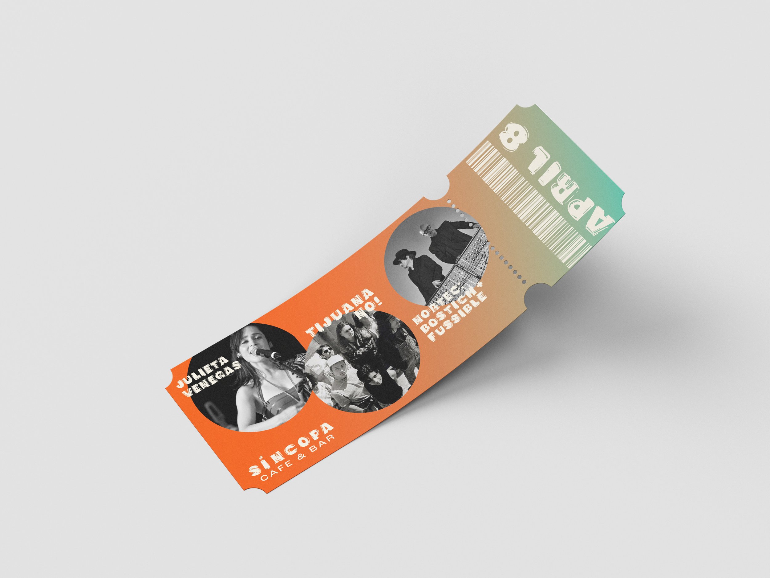
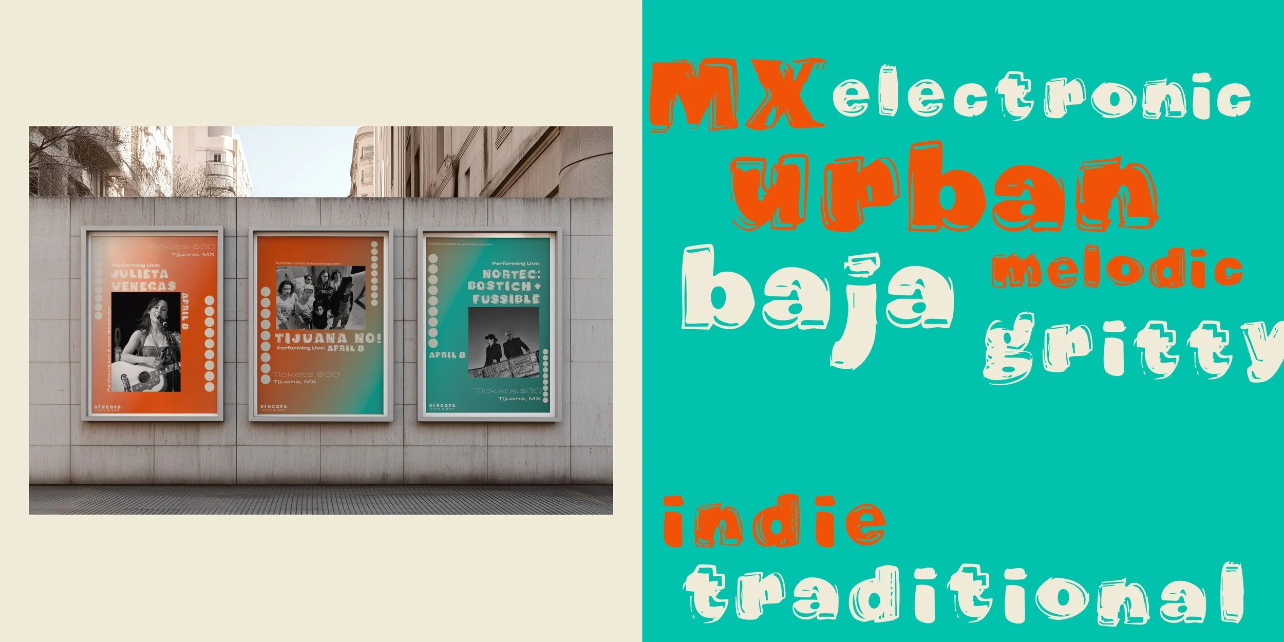
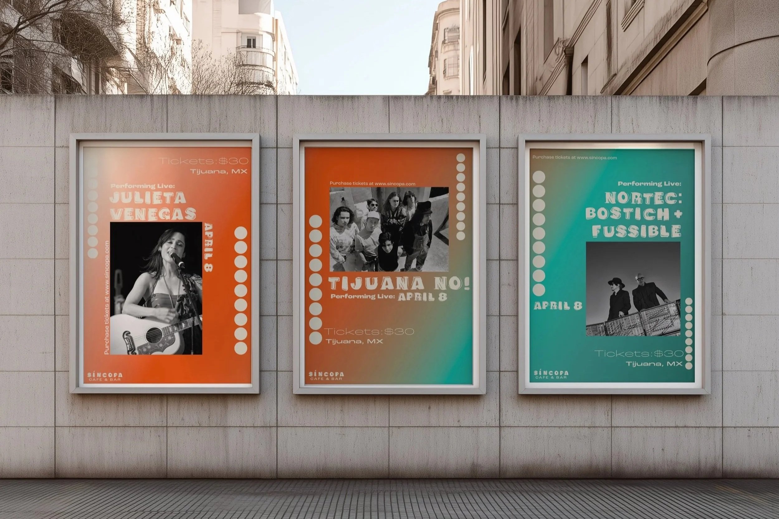
Promotional Design
Three large-format performance posters were designed to promote a live event at the venue, featuring artists aligned with the genre.
Expressive composition and a gradient of orange to teal reflect the atmosphere of live performances within the café-to-bar setting.
Type Specimen Book
A 16-page type specimen book was created to showcase the custom typeface. The book presents the full character set, typographic features, and applied examples within the context of the project.