Mun Matcha Branding
Client Project
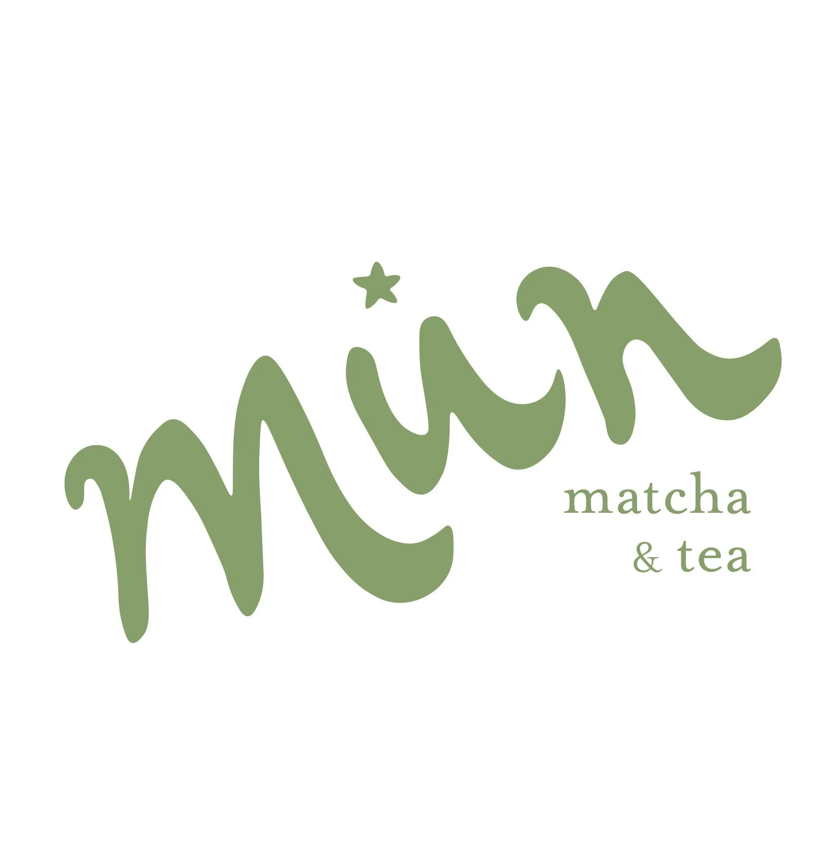
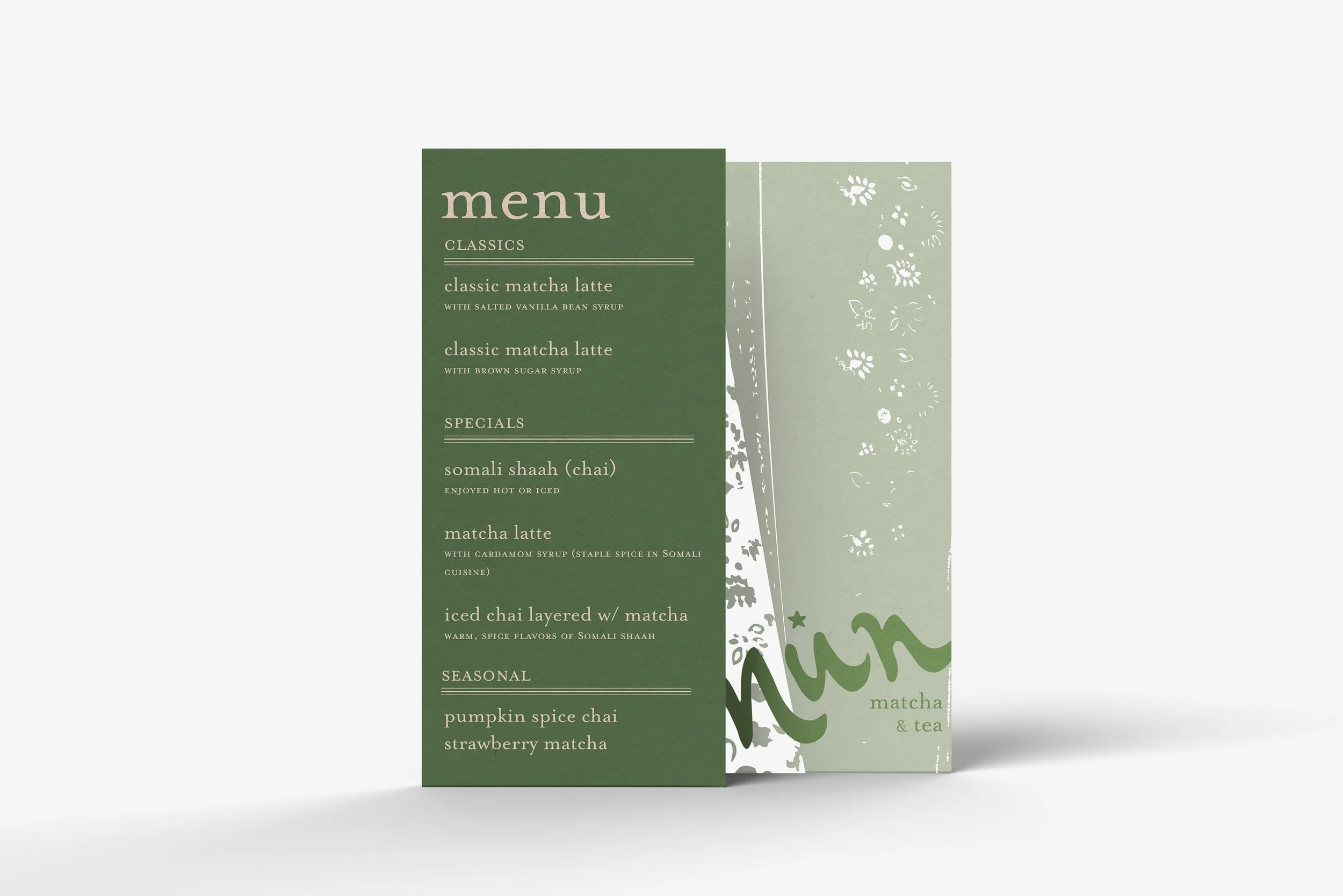
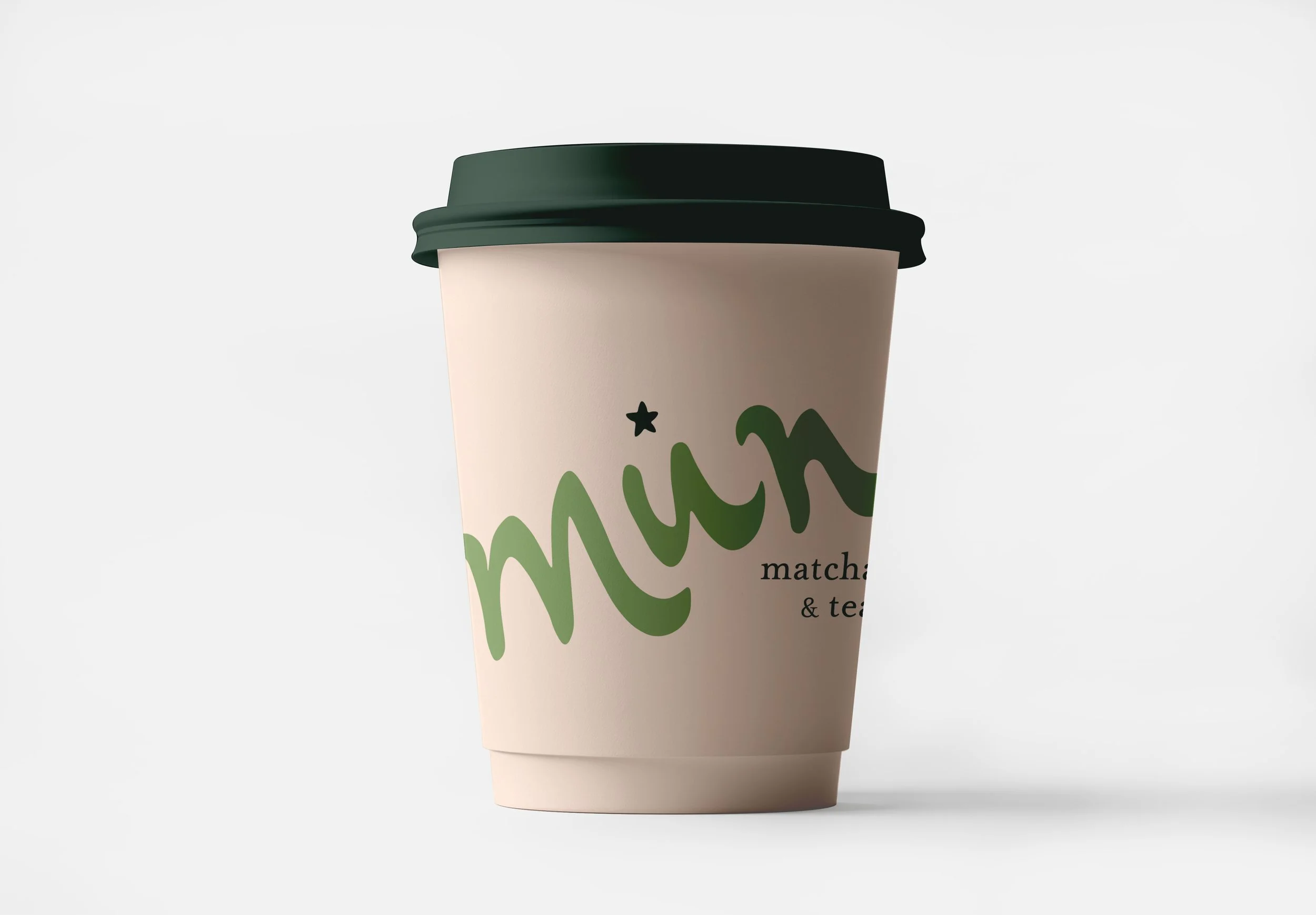
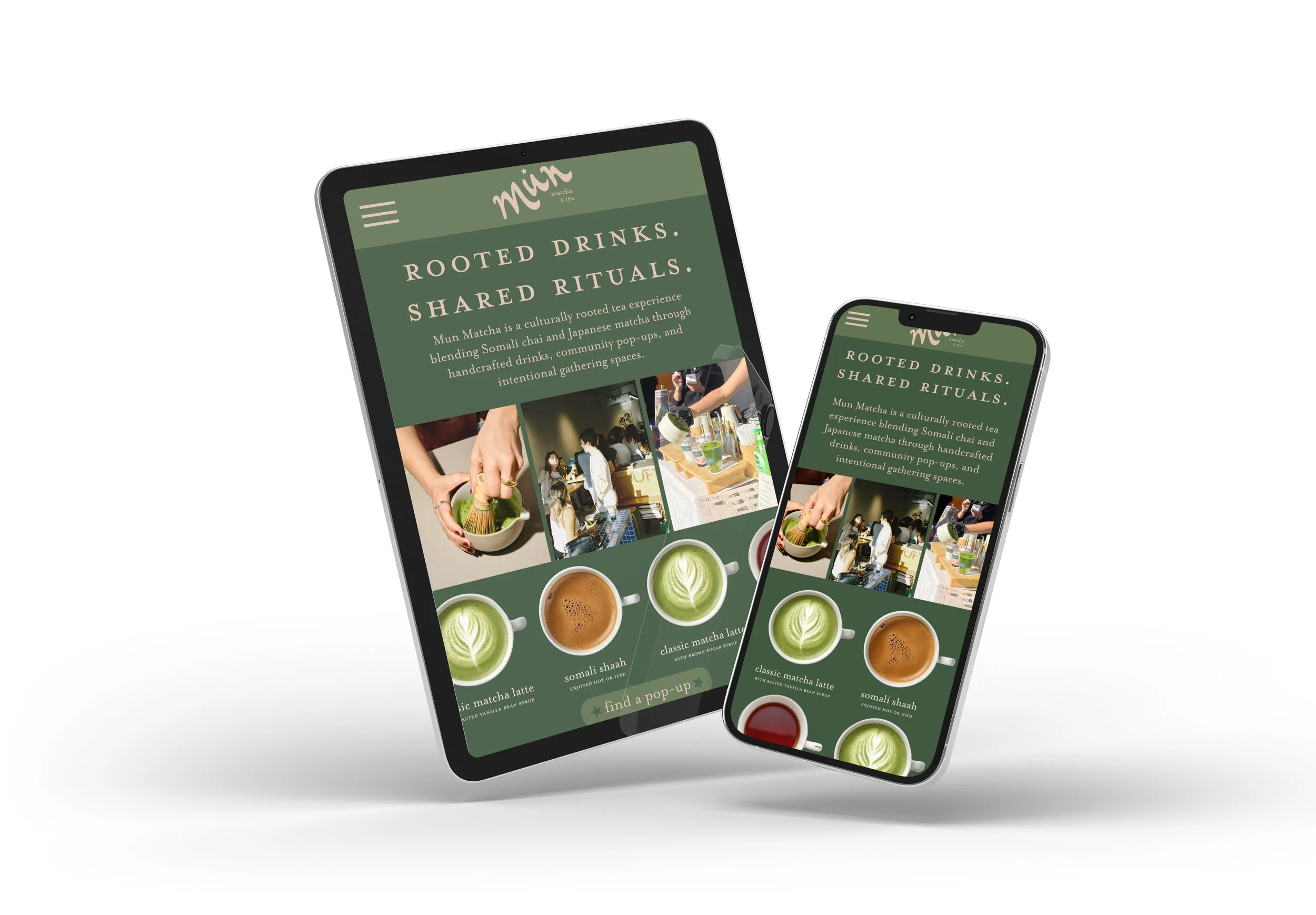
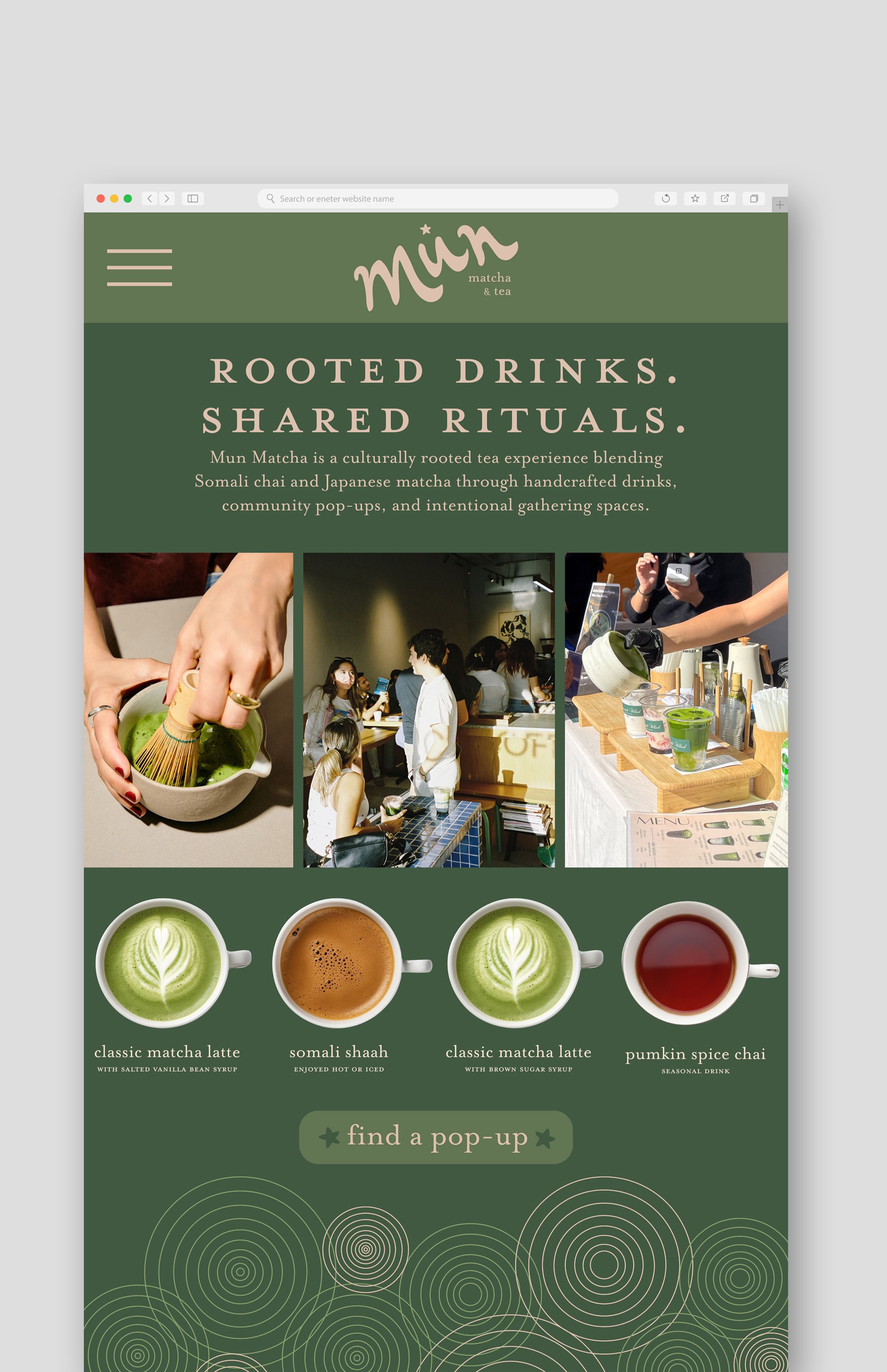
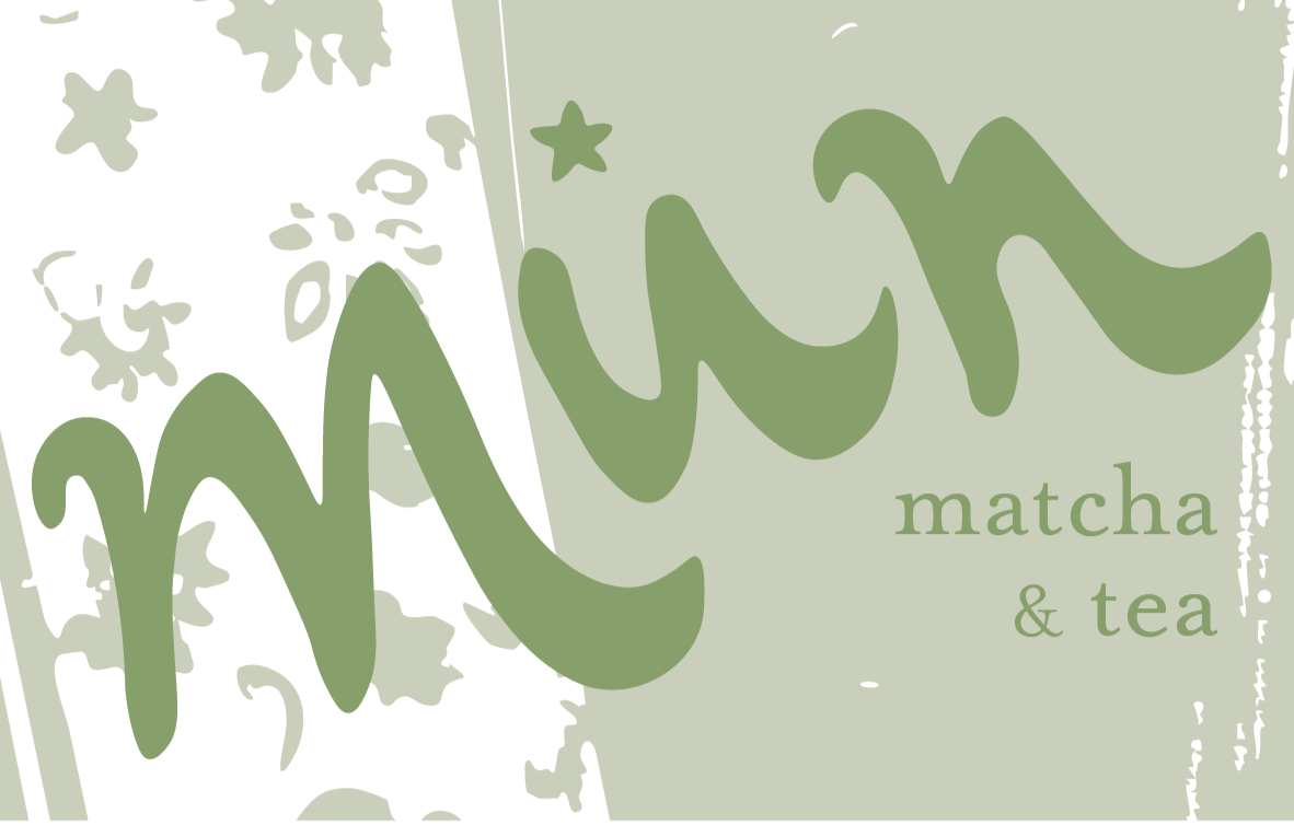
Mun Matcha is a brand rooted in simplicity, cultural identity, and community. The visual identity centers on a minimal, handwritten script logo inspired by Arabic calligraphy, paired with a star symbol referencing Somali culture. The earthy, green-toned color palette reinforces a natural, cohesive feel, while Mrs. Eaves complements the custom logo type with a refined, traditional touch. Patterns draw from Somali and Japanese influences, incorporating stars, concentric circles, and textile-inspired motifs.
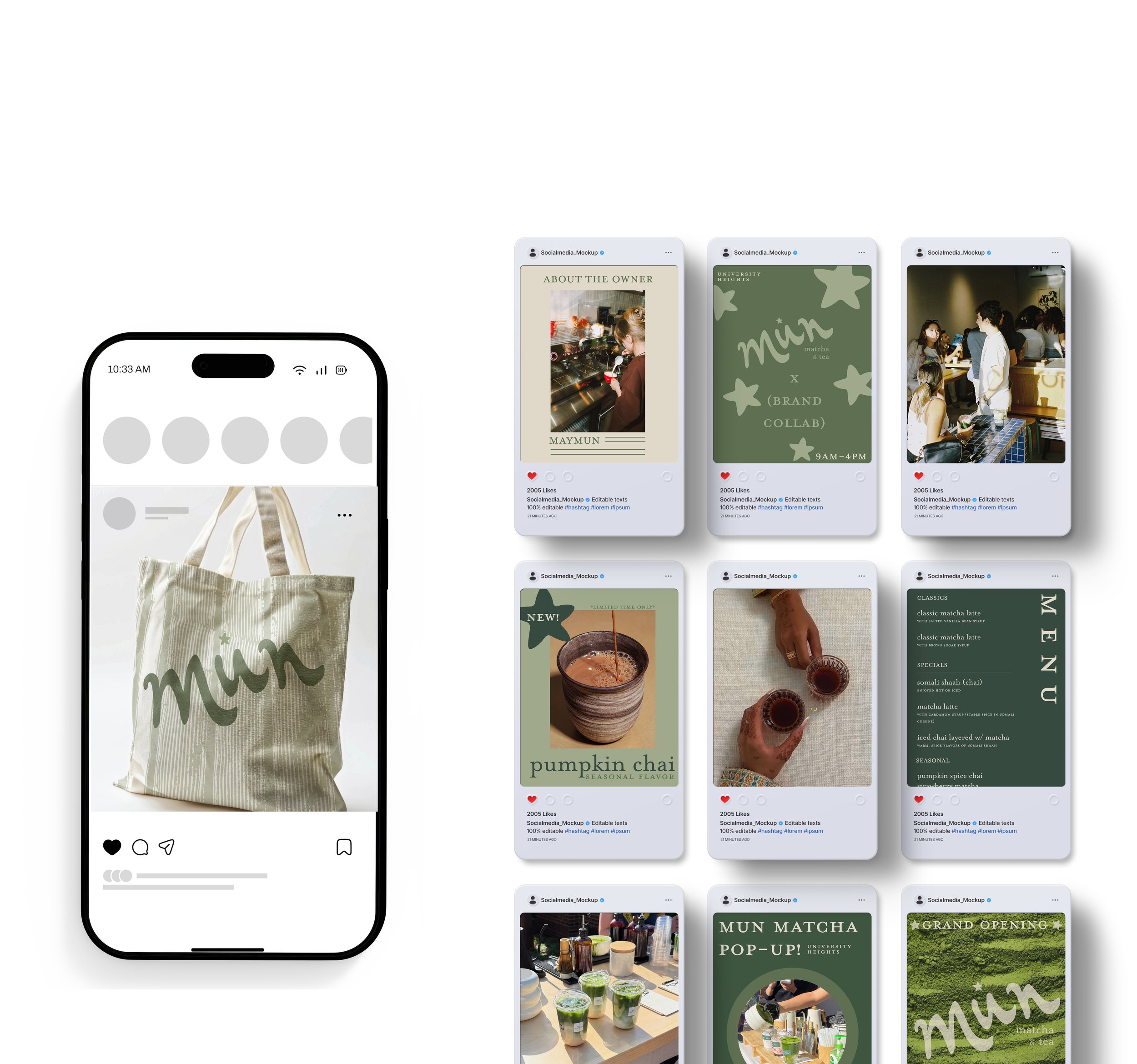
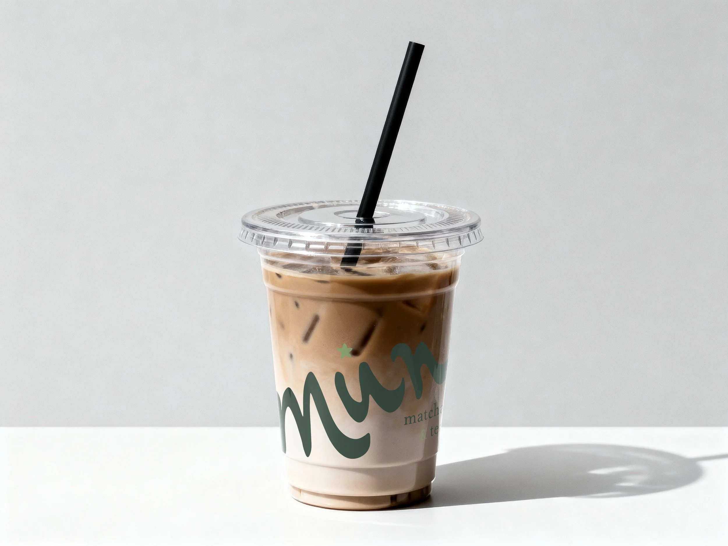
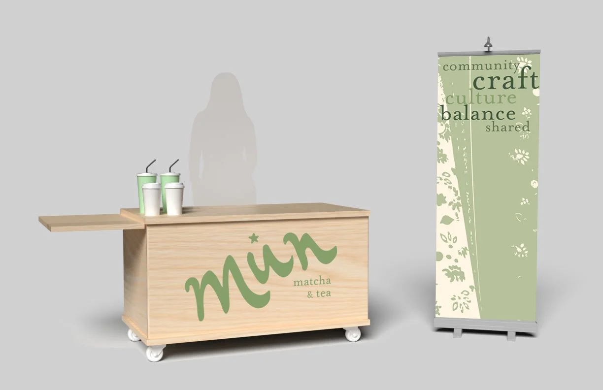
Applications maintain clarity and consistency: menus prioritize clean typography with subtle pattern accents, while cups feature the logo in varied colorways. Social media strategy emphasizes storytelling and engagement through a curated mix of imagery, events, and brand narrative. The website highlights key information with a responsive, user-friendly layout and clear calls to action. Physical elements like the cart and posters use bold, scaled branding for visibility, integrating cultural patterns to reinforce identity across all touchpoints.