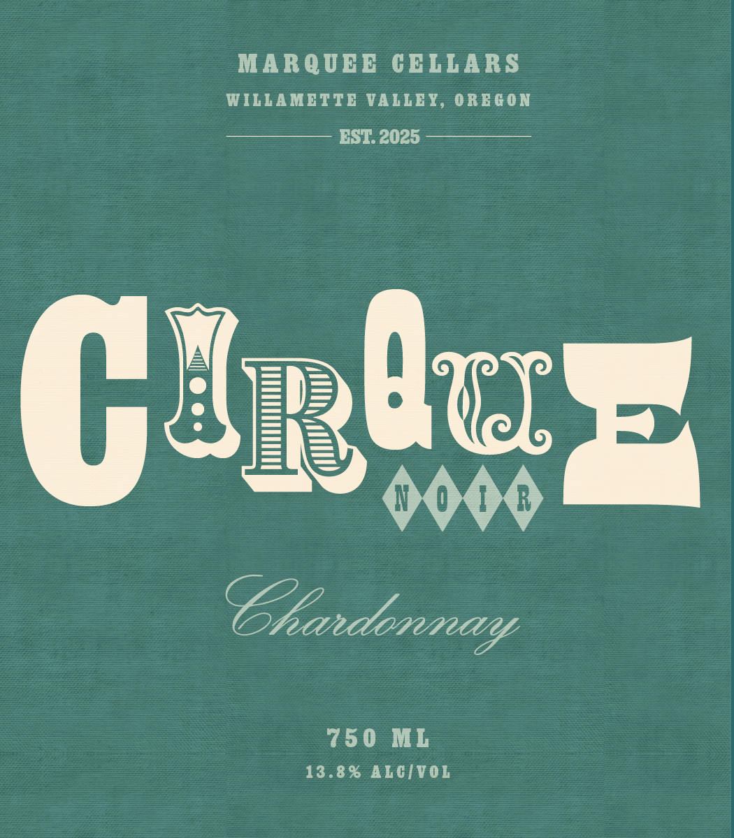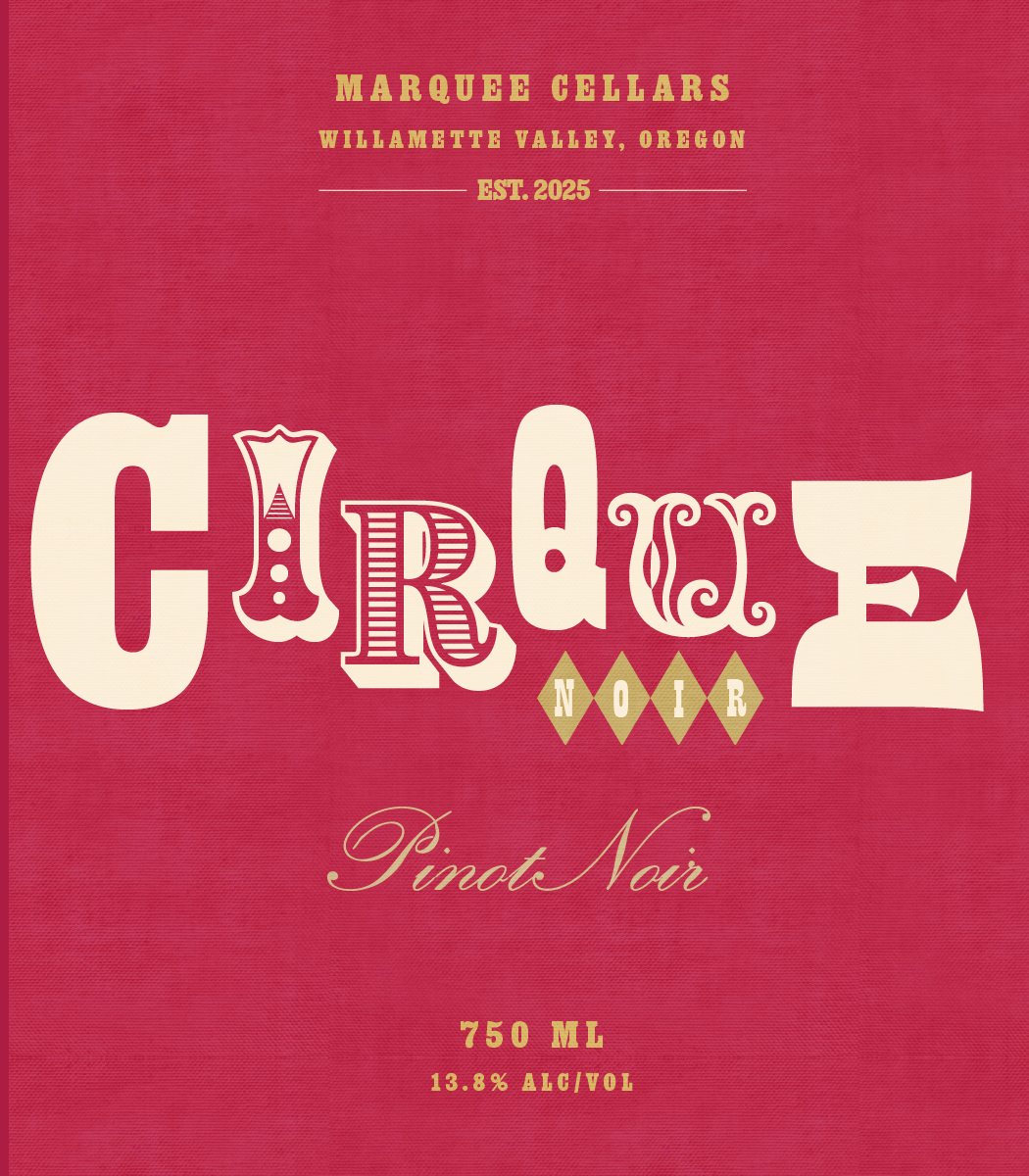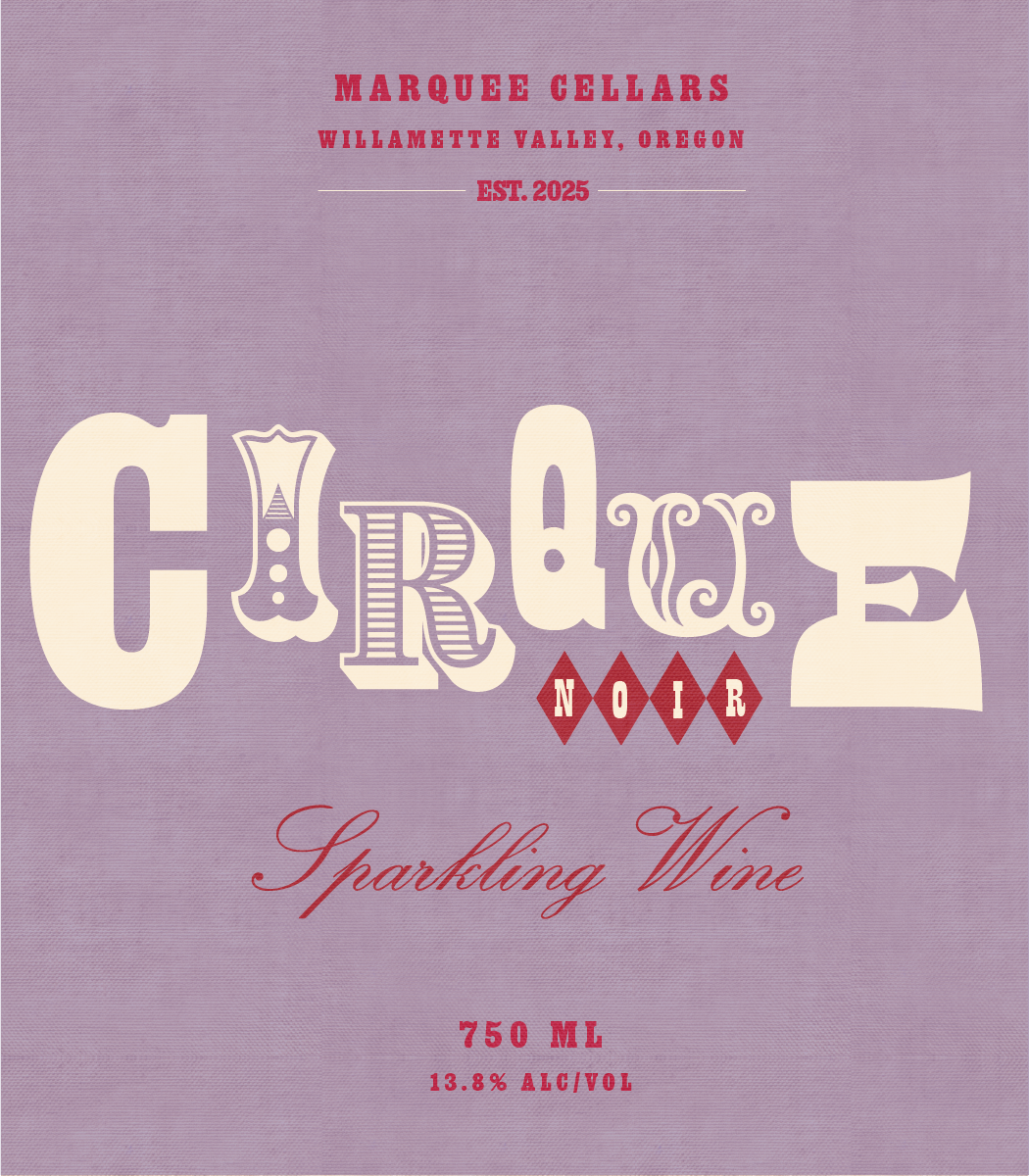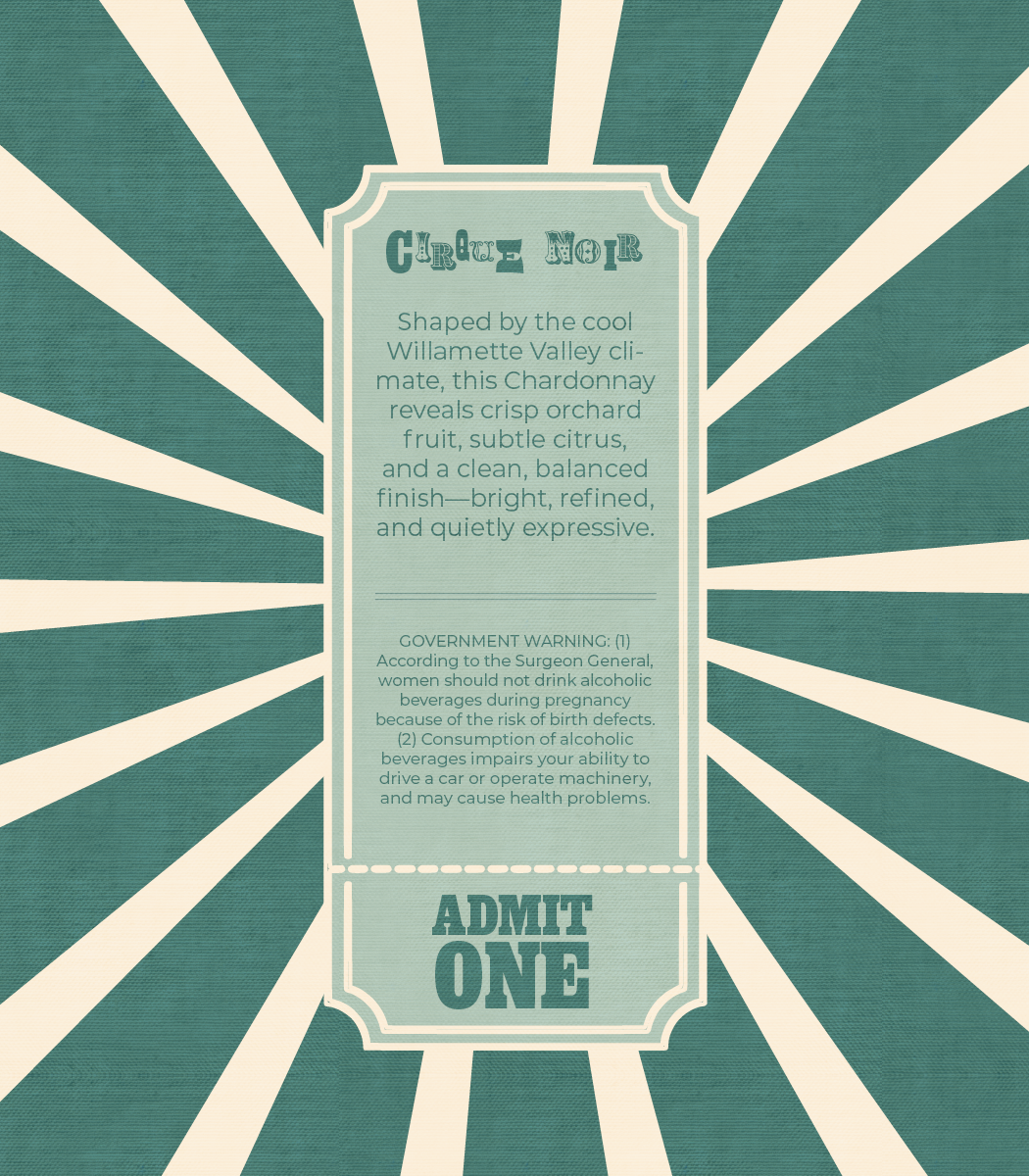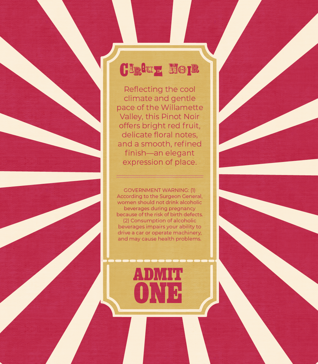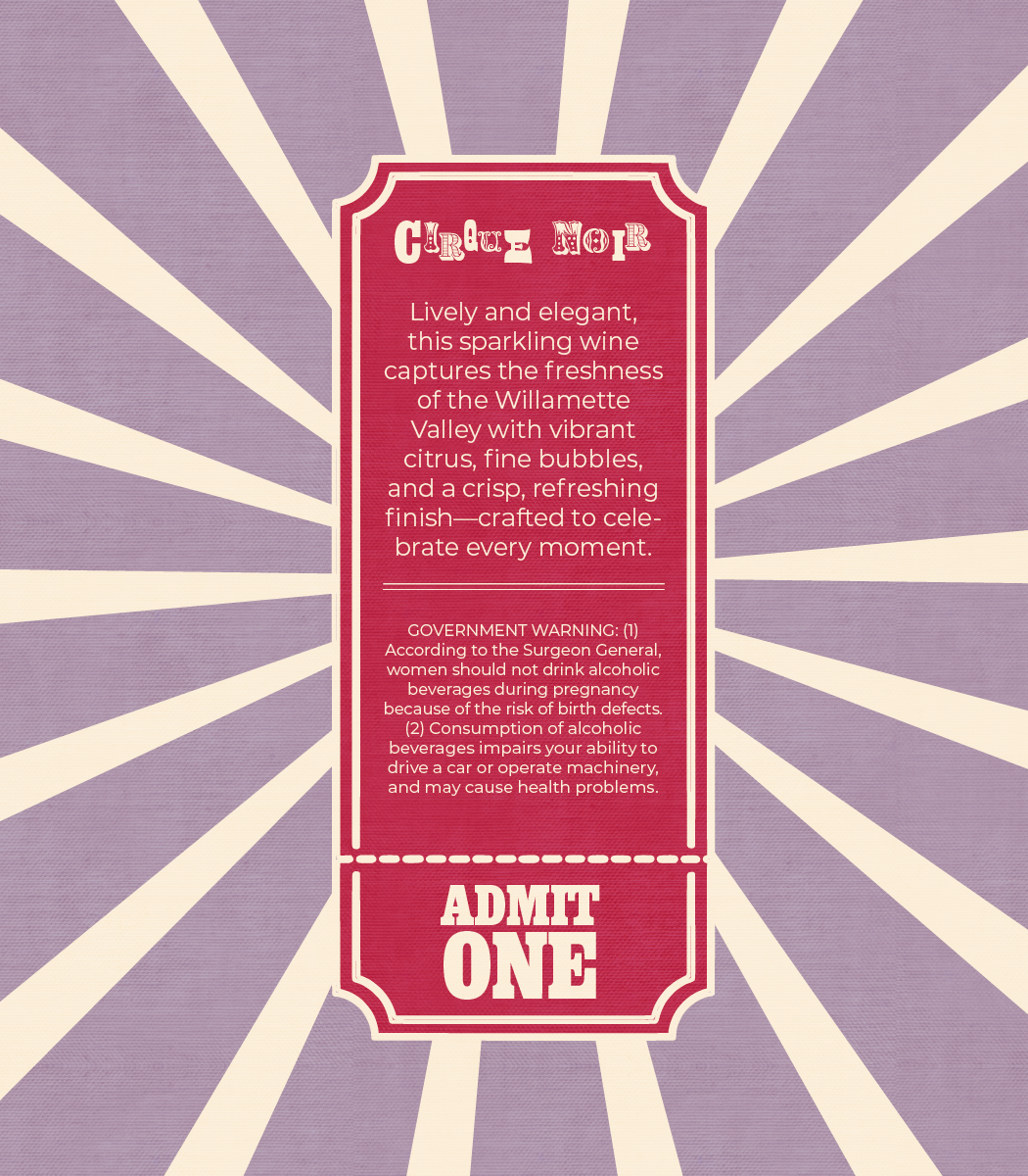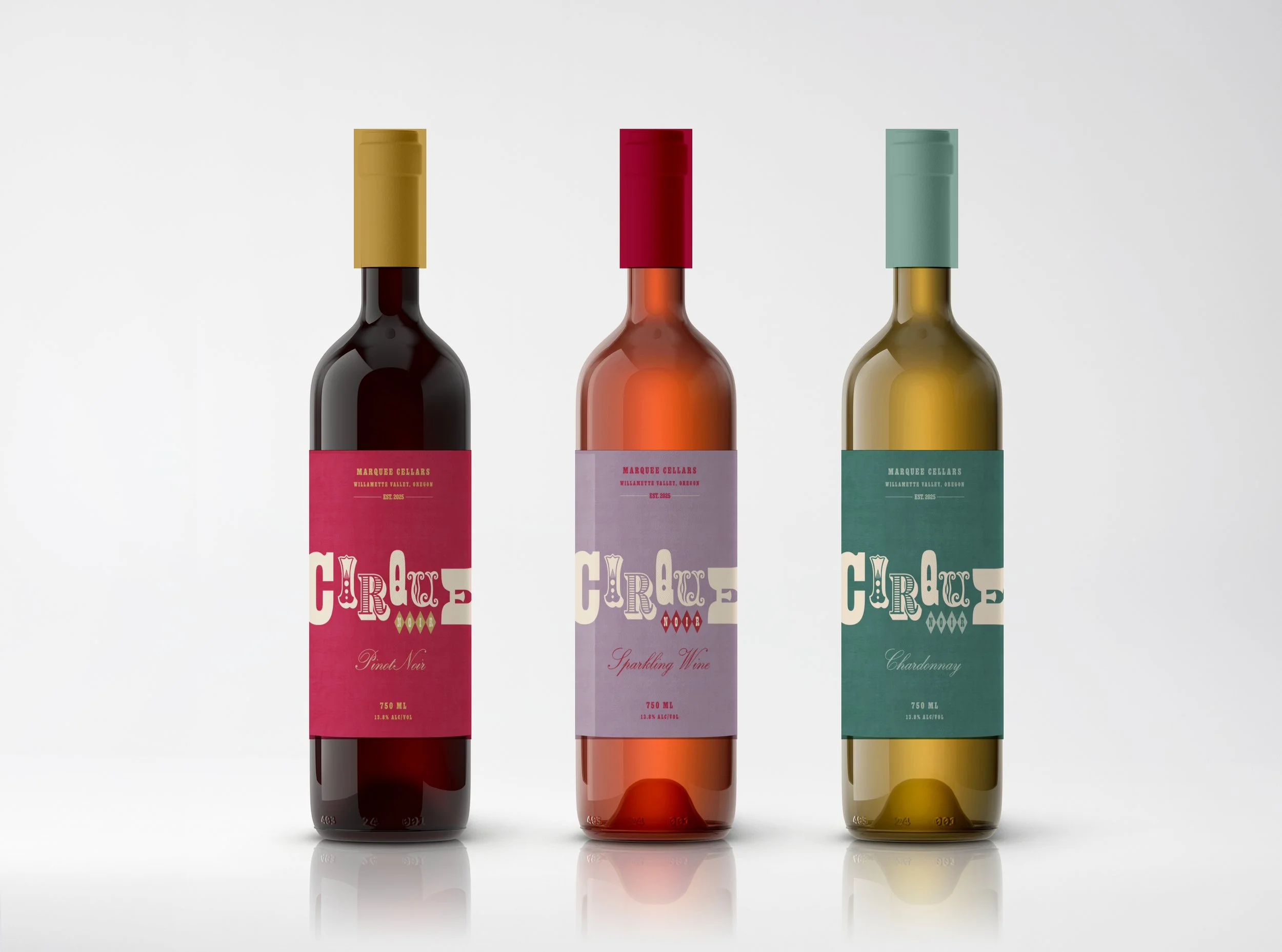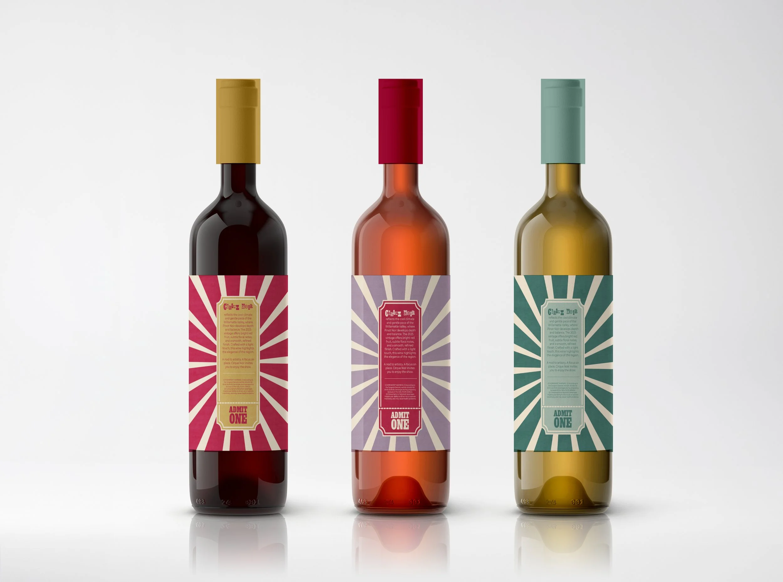
Cirque Noir Wine Label: Packaging
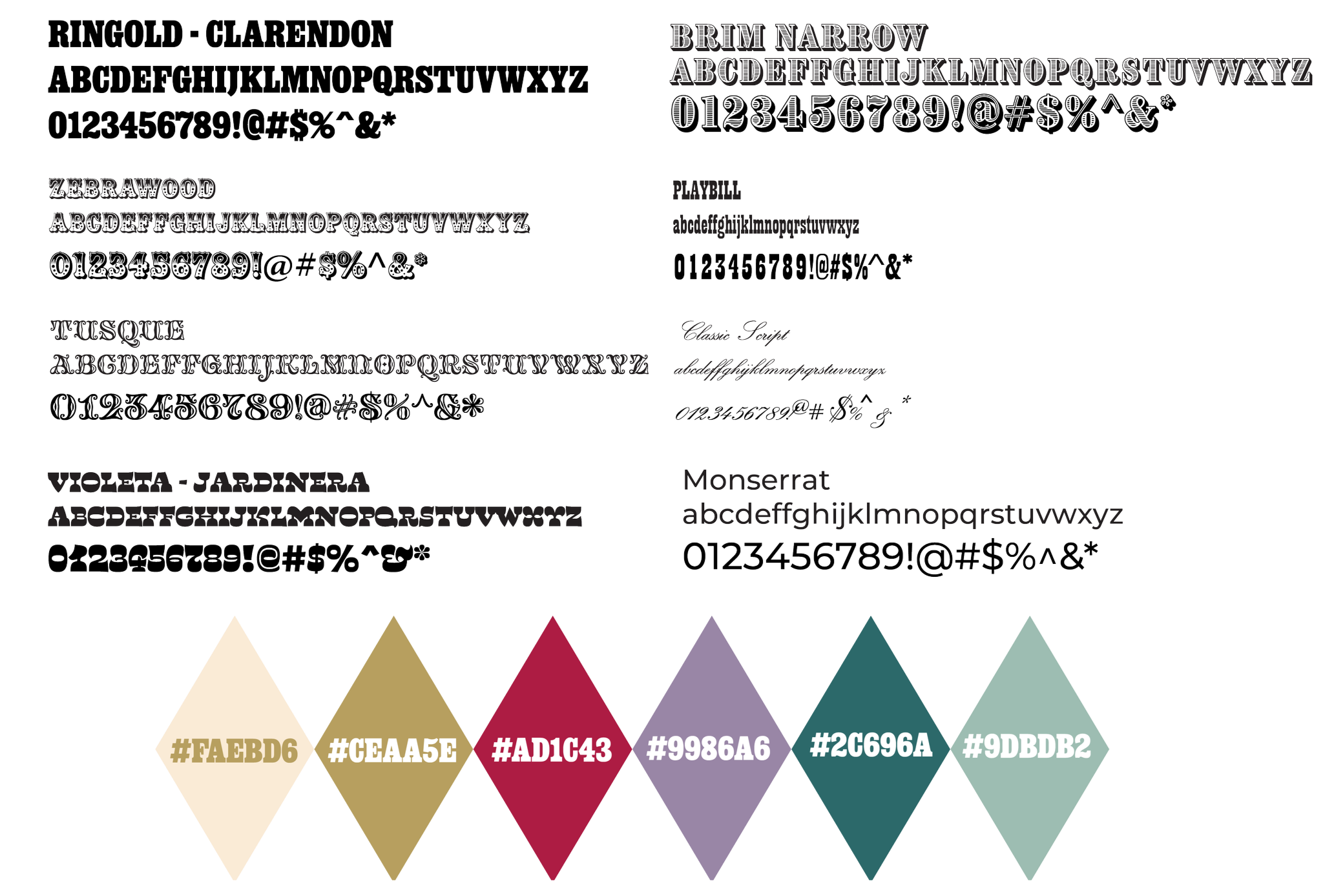
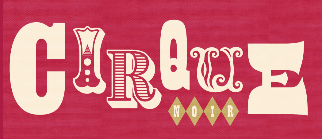
Tasked with creating an experimental wine label series, I drew inspiration from vintage circus posters and made typography the primary focus. The design features a collage of diverse typefaces and colors that capture the bold, attention-grabbing nature of traditional circus advertising.
To introduce a sense of heritage, a classic script is used to highlight the wine varietal, creating contrast with the more expressive typography while reinforcing a traditional feel.
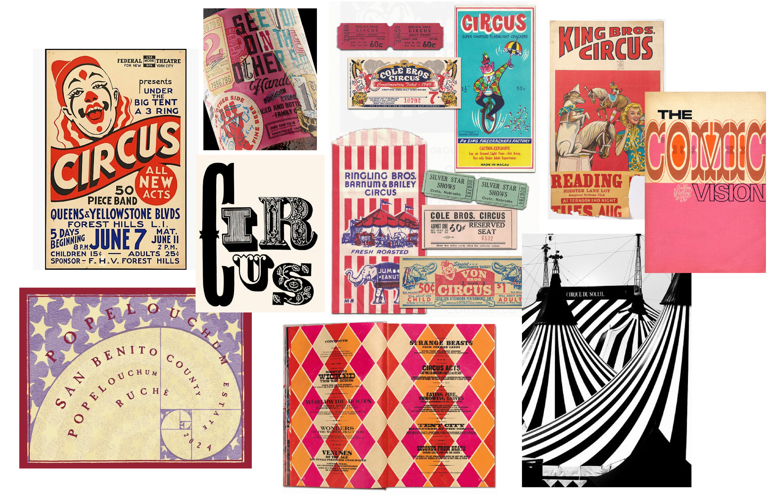
Mood Board
Typography & Color